
The Shopware 6 storefront is based on the Bootstrap framework. Due to our HC-Architecture® ThemeWare® of course it is also completely compatible with Bootstrap.
On this page you will find the most common Bootstrap classes which you can apply to CMS blocks in your Shopping Experiences . Without any programming knowledge!
Note: Shopware has removed !important instructions from Bootstrap utility classes with version 6.6.0 (see NEXT-29246). As a result, these classes no longer overwrite any predefined formatting as before.
Shopware 6.4
- In Shopware 6.4, the Storefront uses Bootstrap 4.
Shopware 6.5
- In Shopware 6.5, the Storefront uses Bootstrap 5.
Tip: You can find some examples of use in our demo shops on the "Bootstrap examples" pages.
Text alignment
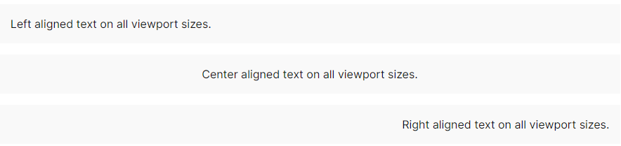
For aligning texts Bootstrap already provides some CSS classes you can use. Please find more about this here.
CSS classes
| Class v5 | Class v4 | Block/Section | Description |
|---|---|---|---|
| text-start | text-left | Block | Align text to the left. |
| text-center | text-center | Block | Align text centered. |
| text-end | text-right | Block | Align text to the right. |
Examples
Text colour (colour)
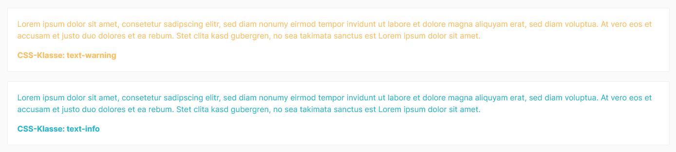
For colouring texts, Bootstrap already provides some classes for different colours. In the following you will find examples of the available colour variants. Please find more about this here.
CSS classes
| Class | Block/Section | Description |
|---|---|---|
| text-primary | Block | Output text in primary colour. |
| text-secondary | Block | Output text in secondary colour. |
| text-success | Block | Output text in the colour "Success". |
| text-danger | Block | Output text in the colour "Error". |
| text-warning | Block | Output text in the colour "Notice". |
| text-info | Block | Output text in the colour "Information". |
| text-white | Block | Output text in the colour "white". |
Examples
Background colour (background-color)
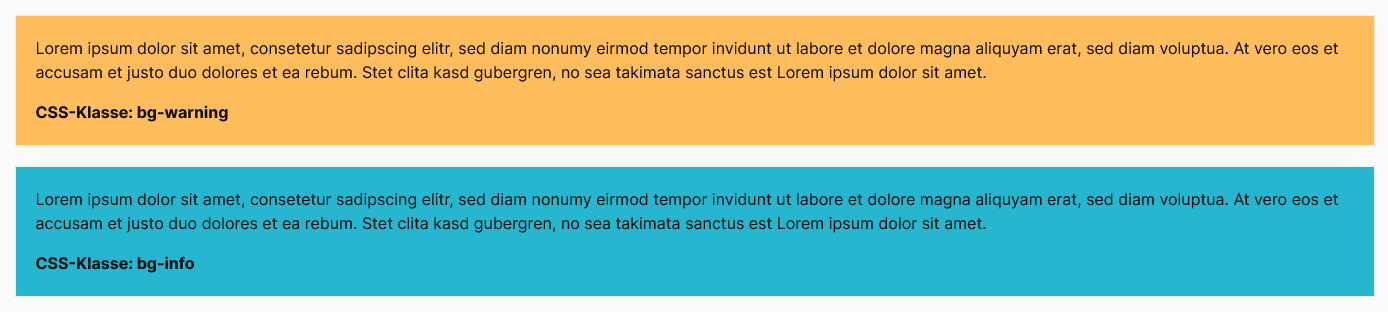
The Bootstrap framework also provides you with classes for adding backgrounds to Shopping Experience elements in different colours. For dark backgrounds it is recommended to choose a light text colour (see above). Please find more about this here.
CSS classes
| Class | Block/Section | Description |
|---|---|---|
| bg-primary | Block | Display background with primary colour. |
| bg-secondary | Block | Display background with secondary colour. |
| bg-success | Block | Display background with the colour "Success". |
| bg-danger | Block | Display background with the colour "Error". |
| bg-warning | Block | Display background with the colour "Notice". |
| bg-info | Block | Display background with the colour "Information". |
Examples
Border (additive)
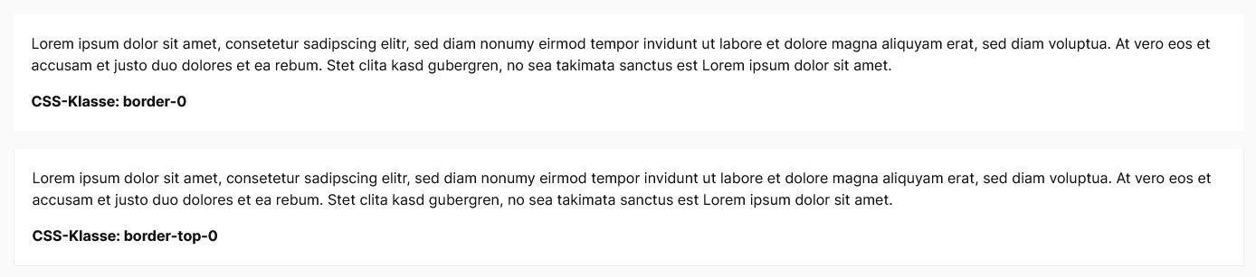
Bootstrap classes can also be used to define the borders of CMS blocks. For example, the class "border-0" removes borders from elements. Please find more about it here.
Note: Please note that the "ThemeWare® CMS-Styling" already represents a framework and additive CSS classes then have no effect. Additive CSS classes are relevant for Shopping Experiences without "ThemeWare® CMS-Styling".
CSS classes
| Class v5 | Class v4 | Block/Section | Description |
|---|---|---|---|
| border | border | Block | Add border. |
| border-top | border-top | Block | Add border on top. |
| border-end | border-right | Block | Add border on the right. |
| border-bottom | border-bottom | Block | Add border at bottom. |
| border-start | border-left | Block | Add border on the left. |
Border (subtractive)
CSS classes
| Class v5 | Class v4 | Block/Section | Description |
|---|---|---|---|
| border-0 | border-0 | Block | Remove border. |
| border-top-0 | border-top-0 | Block | Remove border at top. |
| border-end-0 | border-right-0 | Block | Remove border on the right. |
| border-bottom-0 | border-bottom-0 | Block | Remove border at bottom. |
| border-star-0 | border-left-0 | Block | Remove border on the left. |
Examples
Border colour (border-color)
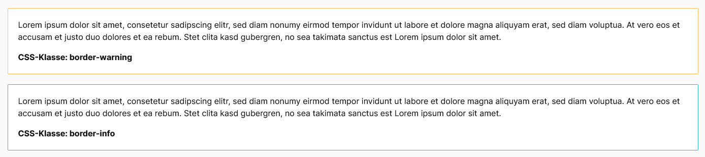
Change the border colour (or border-color) of CMS blocks using the following CSS classes. Please find more about this here.
CSS classes
| Class | Block/Section | Description |
|---|---|---|
| border-primary | Block | Display border with the primary colour. |
| border-secondary | Block | Display border with the secondary colour. |
| border-success | Block | Display border with the colour "Success". |
| border-danger | Block | Display border with the colour "Error". |
| border-warning | Block | Display border with the colour "Notice". |
| border-info | Block | Display border with the colour "Information". |
| border-light | Block | Display border with the colour "light". |
| border-dark | Block | Display border with the colour "dark". |
| border-white | Block | Display border with the colour "white". |
Examples
Border-radius
Add the following CSS classes to a CMS block to easily round off its corners. Please find more about it here.
CSS-Classes
| Class v5 | Class v4 | Block/Section | Description |
|---|---|---|---|
| rounded | rounded | Block | Round off element. |
| rounded-top | rounded-top | Block | Round off element at top |
| rounded-end | rounded-right | Block | Round off element on right. |
| rounded-bottom | rounded-bottom | Block | Round off element at bottom. |
| rounded-start | rounded-left | Block | Round off element on left. |
| rounded-0 | rounded-0 | Block | Do not round off element. |
Example

Shadow
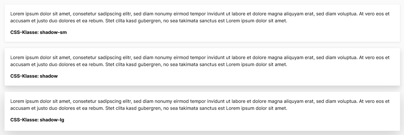
Adding or removing shadows to CMS blocks. Please find more here.
CSS-Classes
| Class | Block/Section | Description |
|---|---|---|
| shadow-sm | Block | Small drop shadow. |
| shadow | Block | Normal drop shadow. |
| shadow-lg | Block | Large drop shadow. |
Examples
Special case: CMS blocks with ThemeWare® CMS styling
Shopware has removed !important instructions from Bootstrap utility classes with version 6.6.0 (see NEXT-29246). As a result, some CSS classes available in Bootstrap are now overwritten by the CMS styling due to the corresponding CSS hierarchy.
If you would like to apply Bootstrap CSS classes to CMS blocks, please note that the ThemeWare® CMS styling overrides the border (border, border-radius), the background colour (background-color) and the margin at the bottom (margin-bottom).
Therefore, remove the CMS styling for the corresponding CMS block with the CSS class twt-cms-block-reset so that the bootstrap classes take effect.
Related links
Bootstrap 5 documentation
Bootstrap 4 documentation