
Top navigation flyout
Field type:
Select
Available values:
• Shopware default
• ThemeWare® Flyout
• ThemeWare® Dropdown*
• ThemeWare® Flyout with cards
• ThemeWare® Flyout with sidebar
• ThemeWare® Flyout with teasers
Example value:ThemeWare® Flyout
Path to the configuration:
Tab "Header" => Block "Top navigation flyout"
Technical name:twt-nav-main-flyout
Choose how the submenus of the top navigation are displayed.
Each category can also override this globally via the category custom field "Top navigation flyout".
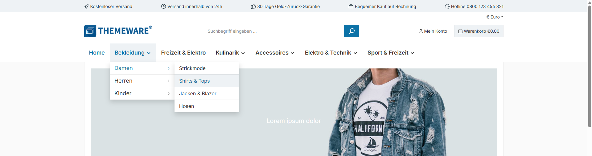
ThemeWare® Dropdown
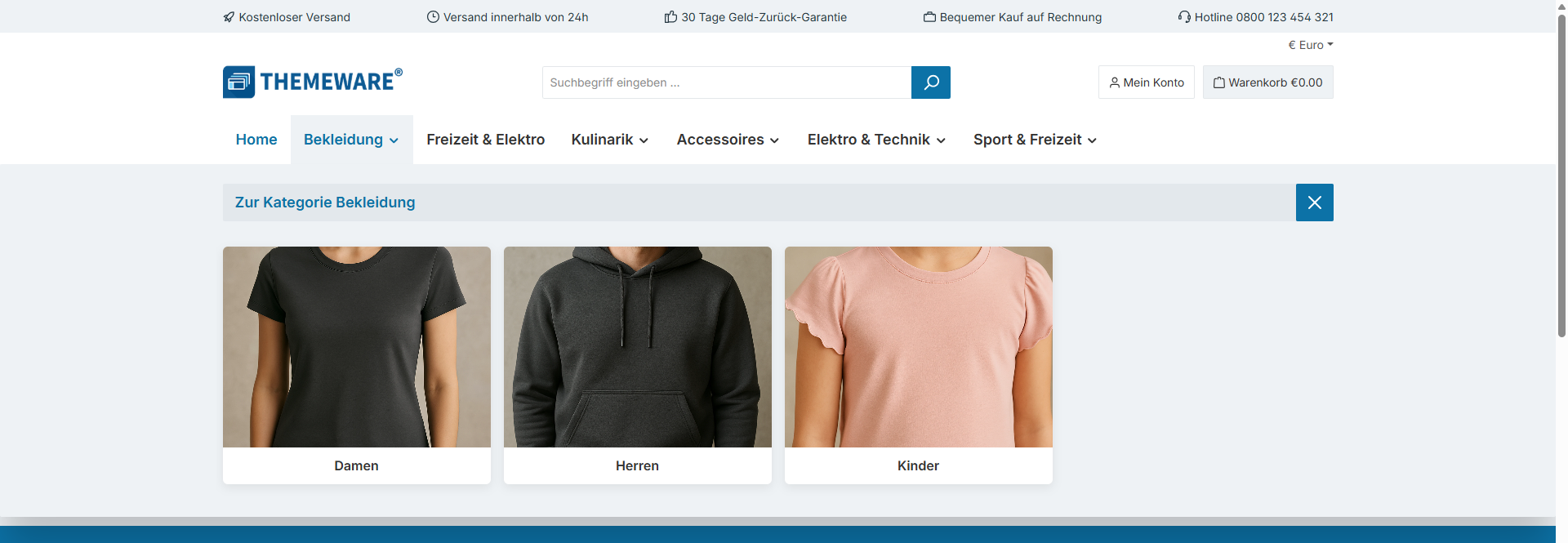
ThemeWare® Flyout with cards
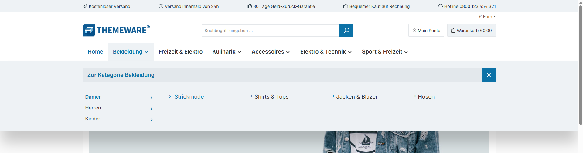
ThemeWare® Flyout with sidebar
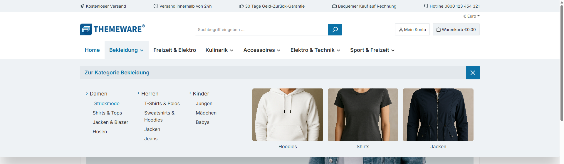
ThemeWare® Flyout with teasers
*) Note: Currently not available in the "Full-width sticky header".
Note: In the layout type "ThemeWare® Flyout with cards", categories of the type "folder" are not displayed because every card needs a target.
Design
Flyout
Field type:
Select
Available values:
• List
• List (Shopware 6)
• List in columns (Shopware 5)
• Buttons
Example value:List
Path to the configuration:
Tab "Header" => Block "Top navigation flyout" => Section "Design"
Technical name:twt-nav-main-flyout-design
Select the design of the flyout.
List (Shopware 6): A line to the left of the categories ensures a clear structure in the flyout.
List: Instead of the line used in Shopware 6, arrows are displayed in front of the categories, as in ThemeWare® for Shopware 5.
List in columns (Shopware 5): The categories are arranged in columns as in the flyout of Shopware 5, the links keep the arrows of the design "List". This design only applies to the flyout — "Flyout with cards", "Flyout with sidebar" and "Flyout with teasers" keep the design "List".
Buttons: Every category gets its own surface with rounded corners. The surface colours are set in the "Colours" section.
Note: The Shopware 5 layout is not recommended if the number of subcategories varies greatly.
Dropdown navigation
Field type:
Select
Available values:
• List
• Buttons
• Buttons (compact)
Example value:Buttons (compact)
Path to the configuration:
Tab "Header" => Block "Top navigation flyout" => Section "Design"
Technical name:twt-nav-main-dropdown-design
Select the design of the dropdown navigation.
List: Plain text without surfaces and without separator lines. The arrow on menu items with subcategories remains.
Buttons (compact): Every menu item is a surface across the full width of the card, separated by lines.
Buttons: The card gets inner spacing, the menu items become inset surfaces with rounded corners.
Beta: This feature may change in an upcoming update, but feel free to test it and send us your feedback.
Basic configuration
Animation
Field type:
Select
Available values:
• no animation (default)
• Fade in
• Fade in from below
• Bounce from below
• Fade in from above
• Bounce from above
• Unfold (3D) #beta
Example value:Fade in
Path to the configuration:
Tab "Header" => Block "Top navigation flyout" => Section "Basic configuration"
Technical name:twt-nav-main-flyout-animation
Navigation levels
Field type:
Select
Available values:
• 1 level
• 2 levels
• 3 levels (default)
• 4 levels
• 5 levels
Example value:3 levels
Path to the configuration:
Tab "Header" => Block "Top navigation flyout" => Section "Basic configuration"
Technical name:twt-nav-main-max-depth
Maximum number of category levels rendered in the navigation (applies to the "ThemeWare® Flyout", "ThemeWare® Dropdown" and "ThemeWare® Flyout with sidebar" modes).
Will only render up to the sales channel's "Navigation levels" setting (Admin → Sales Channels → [Channel] → Navigation), as deeper categories are not loaded into the storefront.
Basic configuration 'ThemeWare® Flyout'
Sizing mode
Field type:
Select
Available values:
• Container-Max-Width (Full-width Boxed)
• 100% (Full-width)
• Boxed
• Custom width
Example value:Container-Max-Width (Full-width Boxed)
Path to the configuration:
Tab "Header" => Block "Top navigation flyout" => Section "Basic configuration 'ThemeWare® Flyout'"
Technical name:twt-nav-main-flyout-sizing-mode
Choose whether the flyout matches the container or spans full width.
Custom width
Field type:
Text field
Example value:100%
Path to the configuration:
Tab "Header" => Block "Top navigation flyout" => Section "Basic configuration 'ThemeWare® Flyout'"
Technical name:twt-nav-main-flyout-width
Set the width for the flyout.
Default: 100%
A value other than 100% is used as max-width. In this case, the flyout extends across the full width but does not exceed the selected value.
Example: 1080px
Drop shadow
Field type:
Select
Available values:
• no shadow
• Small shadow
• Regular shadow
• Larger shadow
• Soft shadow (ThemeWare®)
Example value:Soft shadow (ThemeWare®)
Path to the configuration:
Tab "Header" => Block "Top navigation flyout" => Section "Basic configuration 'ThemeWare® Flyout'"
Technical name:twt-nav-main-flyout-box-shadow-type
Drop shadow of the flyout panel.
The graduated shadows match the ones of the dropdown navigation, but are pulled in at the top so that nothing shows above the navigation bar — the flyout sits flush below it.
Soft (ThemeWare®) is the long-standing ThemeWare® shadow: wide and soft.
Indentation
Field type:
Text field
Example value:10
Path to the configuration:
Tab "Header" => Block "Top navigation flyout" => Section "Basic configuration 'ThemeWare® Flyout'"
Technical name:twt-nav-main-flyout-categories-margin-left
Set the indentation for subcategories in the flyout (in pixels).
Default: 20
Basic configuration 'ThemeWare® Flyout with cards'
Columns
Field type:
Select
Available values:
• Automatic
• 3 columns
• 4 columns
• 5 columns
• 6 columns
Example value:Automatic
Path to the configuration:
Tab "Header" => Block "Top navigation flyout" => Section "Basic configuration 'ThemeWare® Flyout with cards'"
Technical name:twt-nav-main-flyout-cards-columns
Set how many cards are displayed side by side. The value applies to very large screens, smaller screens reduce the number automatically: at most 4 cards on desktop, at most 3 on tablets and always 2 on smartphones.
Automatic: 4 cards from large screens — in the sizing mode "100% (Full-width)" 6 cards from very large screens.
Note: This setting only applies to the "ThemeWare® Flyout with cards" mode.
Basic configuration 'ThemeWare® Dropdown'
Drop shadow
Field type:
Select
Available values:
• no shadow (default)
• Small shadow (Bootstrap)
• Regular shadow (Bootstrap)
• Larger shadow (Bootstrap)
Example value:Regular shadow (Bootstrap)
Path to the configuration:
Tab "Header" => Block "Top navigation flyout" => Section "Basic configuration 'ThemeWare® Dropdown'"
Technical name:twt-nav-main-dropdown-box-shadow-type
Adds a drop shadow to the submenus.
Beta: This feature may change in an upcoming update, but feel free to test it and send us your feedback.
Colour configuration
Text colour (menu items)
Field type:
Color picker
Example value:#333333
Path to the configuration:
Tab "Header" => Block "Top navigation flyout" => Section "Colour configuration"
Technical name:twt-nav-main-flyout-categories-color
Text colour (menu items) @hover
Field type:
Color picker
Example value:$sw-color-brand-primary
Path to the configuration:
Tab "Header" => Block "Top navigation flyout" => Section "Colour configuration"
Technical name:twt-nav-main-flyout-categories-color-hover
Text colour (menu items) @active
Field type:
Color picker
Example value:$sw-color-brand-primary
Path to the configuration:
Tab "Header" => Block "Top navigation flyout" => Section "Colour configuration"
Technical name:twt-nav-main-flyout-categories-color-active
Background colour (menu items)
Field type:
Color picker
Example value:#ffffff
Path to the configuration:
Tab "Header" => Block "Top navigation flyout" => Section "Colour configuration"
Technical name:twt-nav-main-flyout-categories-background-color
Colours the surface of a single menu item.
Note: In the flyout this setting is only applied when the design "Buttons" is set. In the dropdown navigation it is applied in the designs "Buttons (compact)" and "Buttons".
Background colour (menu items) @hover
Field type:
Color picker
Example value:#e3e8ec
Path to the configuration:
Tab "Header" => Block "Top navigation flyout" => Section "Colour configuration"
Technical name:twt-nav-main-flyout-categories-background-color-hover
Colours the surface of a menu item on hover.
Note: In the flyout this setting is only applied when the design "Buttons" is set. In the dropdown navigation it is applied in the designs "Buttons (compact)" and "Buttons".
Background colour (menu items) @active
Field type:
Color picker
Example value:#e3e8ec
Path to the configuration:
Tab "Header" => Block "Top navigation flyout" => Section "Colour configuration"
Technical name:twt-nav-main-flyout-categories-background-color-active
Colours the surface of the menu item of the active category. Hovering it shows the hover colour.
Note: In the flyout this setting is only applied when the design "Buttons" is set. In the dropdown navigation it is applied in the designs "Buttons (compact)" and "Buttons".
Icon colour (menu items)
Field type:
Color picker
Example value:$sw-color-brand-primary
Path to the configuration:
Tab "Header" => Block "Top navigation flyout" => Section "Colour configuration"
Technical name:twt-nav-main-flyout-categories-icon-color
Colour (separator)
Field type:
Color picker
Example value:#bcc1c7
Path to the configuration:
Tab "Header" => Block "Top navigation flyout" => Section "Colour configuration"
Technical name:twt-nav-main-flyout-seperator-color
Note: This configuration refers to the separator line in the design "List (Shopware 6)" and to the separator lines in the dropdown design "Buttons (compact)".
Background colour (panel)
Field type:
Color picker
Example value:#eef2f5
Path to the configuration:
Tab "Header" => Block "Top navigation flyout" => Section "Colour configuration"
Technical name:twt-nav-main-flyout-background-color
Colours the surface of the submenu itself: the wide panel in the flyout, the card in the dropdown navigation.
Glass effect [px] (panel)
Field type:
Number field
Example value:0
Path to the configuration:
Tab "Header" => Block "Top navigation flyout" => Section "Colour configuration"
Technical name:twt-nav-main-flyout-backdrop-effect-blur
Blurs the content behind the panel and thereby creates a glass effect in the style of "Liquid Glass". Recommended value: 10.
Note: The effect only becomes visible if a semi-transparent colour is selected as the background colour.
Level 1
Font family
Field type:
Select
Available values:
• Text
• Headlines
Example value:Text
Path to the configuration:
Tab "Header" => Block "Top navigation flyout" => Section "Level 1"
Technical name:twt-nav-main-flyout-font-family
Font size
Field type:
Number field
Example value:18
Path to the configuration:
Tab "Header" => Block "Top navigation flyout" => Section "Level 1"
Technical name:twt-nav-main-flyout-font-size
Font weight
Field type:
Select
Available values:
• light
• normal
• bold
Example value:normal
Path to the configuration:
Tab "Header" => Block "Top navigation flyout" => Section "Level 1"
Technical name:twt-nav-main-flyout-font-weight
Text formatting
Field type:
Select
Available values:
• none
• uppercase
• lowercase
• capitalize
Example value:none
Path to the configuration:
Tab "Header" => Block "Top navigation flyout" => Section "Level 1"
Technical name:twt-nav-main-flyout-text-transform
Level 2
Font family
Field type:
Select
Available values:
• Text
• Headlines
Example value:Text
Path to the configuration:
Tab "Header" => Block "Top navigation flyout" => Section "Level 2"
Technical name:twt-nav-main-flyout-level1-font-family
Font size
Field type:
Number field
Example value:16
Path to the configuration:
Tab "Header" => Block "Top navigation flyout" => Section "Level 2"
Technical name:twt-nav-main-flyout-level1-font-size
Font weight
Field type:
Select
Available values:
• light
• normal
• bold
Example value:normal
Path to the configuration:
Tab "Header" => Block "Top navigation flyout" => Section "Level 2"
Technical name:twt-nav-main-flyout-level1-font-weight
Text formatting
Field type:
Select
Available values:
• none
• uppercase
• lowercase
• capitalize
Example value:none
Path to the configuration:
Tab "Header" => Block "Top navigation flyout" => Section "Level 2"
Technical name:twt-nav-main-flyout-level1-text-transform
Level 3...
Font family
Field type:
Select
Available values:
• Text
• Headlines
Example value:Text
Path to the configuration:
Tab "Header" => Block "Top navigation flyout" => Section "Level 3..."
Technical name:twt-nav-main-flyout-level2-font-family
Font size
Field type:
Number field
Example value:16
Path to the configuration:
Tab "Header" => Block "Top navigation flyout" => Section "Level 3..."
Technical name:twt-nav-main-flyout-level2-font-size
Font weight
Field type:
Select
Available values:
• light
• normal
• bold
Example value:normal
Path to the configuration:
Tab "Header" => Block "Top navigation flyout" => Section "Level 3..."
Technical name:twt-nav-main-flyout-level2-font-weight
Text formatting
Field type:
Select
Available values:
• none
• uppercase
• lowercase
• capitalize
Example value:none
Path to the configuration:
Tab "Header" => Block "Top navigation flyout" => Section "Level 3..."
Technical name:twt-nav-main-flyout-level2-text-transform
Categorie button
Show flyout bar (Category link and the close button)
Field type:
Select
Available values:
• don't show
• show at top
• show at bottom (currently inactive)
Example value:show at top
Path to the configuration:
Tab "Header" => Block "Top navigation flyout" => Section "Categorie button"
Technical name:twt-nav-main-flyout-bar-show
The "Flyout bar" consists of a category link and the close button.
Accessibility concerns:
Disabling this feature may make parts of your storefront inaccessible to users with disabilities. This may result in non-compliance with accessibility laws applicable in your jurisdiction (e.g., the European Accessibility Act). By disabling the "Flyout bar" you acknowledge this risk and accept full responsibility.
Padding top/bottom
Field type:
Number field
Example value:15
Path to the configuration:
Tab "Header" => Block "Top navigation flyout" => Section "Categorie button"
Technical name:twt-nav-main-flyout-bar-padding-top-bottom
Padding left/right
Field type:
Number field
Example value:15
Path to the configuration:
Tab "Header" => Block "Top navigation flyout" => Section "Categorie button"
Technical name:twt-nav-main-flyout-bar-padding-left-right
Text colour
Field type:
Color picker
Example value:$sw-color-brand-primary
Path to the configuration:
Tab "Header" => Block "Top navigation flyout" => Section "Categorie button"
Technical name:twt-nav-main-flyout-bar-color
Text colour @hover
Field type:
Color picker
Example value:#333333
Path to the configuration:
Tab "Header" => Block "Top navigation flyout" => Section "Categorie button"
Technical name:twt-nav-main-flyout-bar-color-hover
Background colour
Field type:
Color picker
Example value:#e3e8ec
Path to the configuration:
Tab "Header" => Block "Top navigation flyout" => Section "Categorie button"
Technical name:twt-nav-main-flyout-bar-background-color
Close button
Padding
Field type:
Number field
Example value:15
Path to the configuration:
Tab "Header" => Block "Top navigation flyout" => Section "Close button"
Technical name:twt-nav-main-flyout-close-btn-padding