
The USP bar shows key selling points (USPs) as a compact bar – optionally in the header and/or the footer.
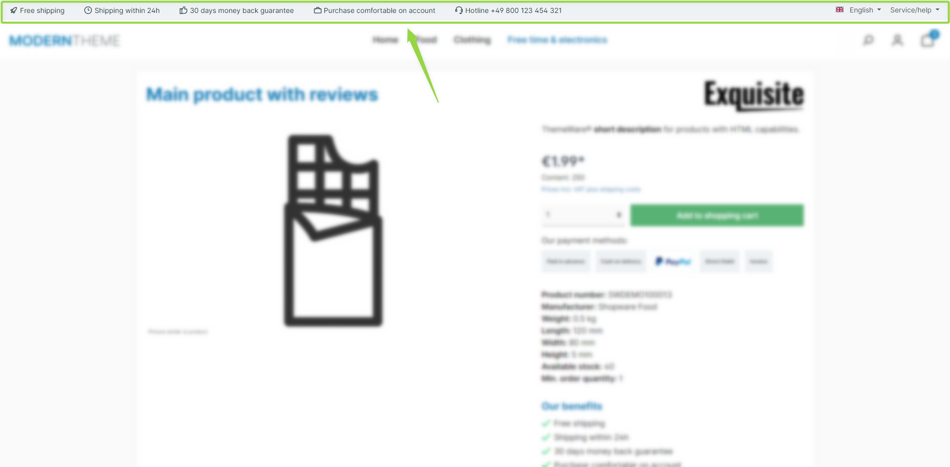
ThemeWare® "USP bar"
Note: The USP bar is shown in the header and/or footer, depending on which of the two configurations ("Show USP bar in header" / "Show USP bar in footer") is enabled. The content of the individual USPs is maintained via snippets.
Configuration
Theme configuration
- Go to the "Extensions" tab
- Expand the "USP bar" block
- Enable "Show USP bar in header" and/or "Show USP bar in footer"
- Save your changes after editing
Content
- For each USP (1–6) you maintain the icon, title, subtitle and tooltip via a dedicated snippet – shown here for USP 1 as an example:
twt.extension.uspBar.usp1.icontwt.extension.uspBar.usp1.titletwt.extension.uspBar.usp1.subtitletwt.extension.uspBar.usp1.tooltip
Note: For information on how to edit snippets, see the following instructions: Texts: Editing and translation
Tip: If a change does not affect the storefront, just clear the Shopware cache: Clearing / warming up the Shopware cache
Options
- Position (Header)
- Places the bar "above the header", "above the navigation" or "below the header". (The full-width sticky header and the shopping experience header only support "above the header".)
- Position (Footer)
- Places the bar "above the footer".
- Layout type (Header)
- "Small icons", "Small icons + Top bar" (moves the top bar into the USP bar) or "Small icons + Widget" (places a widget on the right, see "Content (Widget)").
- Layout type (Footer)
- "Small icons", "Large icons, text below" or "Large icons, text beside".
- Show subtitle (Large icons)
- Shows the subtitle below the title – only for layout types with large icons.
- Content (Widget)
- Selects the widget for the "Small icons + Widget" layout type: "don't show" or "Communities or social media" (configured in the "Widgets" tab).
- Sizing mode (Header) / Sizing mode (Footer)
- Width of the bar: "Container-Max-Width (Full-width Boxed)" or "100% (Full-width)".
- Show benefit #1–6 from ... (section "USPs")
- Controls, per USP, from which breakpoint it appears (e.g. "Phone (portrait) (<576px)", "Tablet (portrait) (≥768px)", "Desktop (≥1200px)") or "don't show".
Summary
Theme configuration
- Tab "Extensions" => Block "USP bar" => Show USP bar in header / Show USP bar in footer
- Tab "Extensions" => Block "USP bar" => Section "Basic configuration" => Position (Header/Footer) / Layout type (Header/Footer) / Show subtitle (Large icons) / Content (Widget) / Sizing mode (Header/Footer)
- Tab "Extensions" => Block "USP bar" => Section "USPs" => Show benefit #1–6 from ...
Snippets
- Icons
twt.extension.uspBar.usp1.icontwt.extension.uspBar.usp2.icontwt.extension.uspBar.usp3.icontwt.extension.uspBar.usp4.icontwt.extension.uspBar.usp5.icontwt.extension.uspBar.usp6.icon
- Titles
twt.extension.uspBar.usp1.titletwt.extension.uspBar.usp2.titletwt.extension.uspBar.usp3.titletwt.extension.uspBar.usp4.titletwt.extension.uspBar.usp5.titletwt.extension.uspBar.usp6.title
- Subtitles
twt.extension.uspBar.usp1.subtitletwt.extension.uspBar.usp2.subtitletwt.extension.uspBar.usp3.subtitletwt.extension.uspBar.usp4.subtitletwt.extension.uspBar.usp5.subtitletwt.extension.uspBar.usp6.subtitle
- Tooltips
twt.extension.uspBar.usp1.tooltiptwt.extension.uspBar.usp2.tooltiptwt.extension.uspBar.usp3.tooltiptwt.extension.uspBar.usp4.tooltiptwt.extension.uspBar.usp5.tooltiptwt.extension.uspBar.usp6.tooltip
- Aria label
twt.extension.uspBar.ariaLabel.headertwt.extension.uspBar.ariaLabel.footer