
ThemeWare® 5.3.1 is now available! 🎉 The new release includes the following changes:
Highlights
- New animations for the hover image in product boxes
- Hover image in product boxes now also on smartphones and tablets Feature-Request
Changes
- Compatibility for Shopware 6.7.15 improved
- New layout type "integrated" for the submit button of the newsletter widget
- New layout type "integrated" for the search button in the header
- New layout type "Arrow (no area)" for the slider navigation arrows
- New hover colours for the search button in the header
- New configuration for the spacing between products in the product slider
- New configuration for the shadow of the elements on the product image
- New configuration for the shadow of the slider navigation arrows
- New configuration for the vertical position of the navigation arrows in the product slider
- New option: navigation arrows in the hero slider inherit the configuration of the slider arrows
- Display of the cookie notice in the modal layouts improved
- Accessibility of the headings in the footer improved
- Hover image in product boxes now also in the list view
- Hover effects "reduce opacity" and "scale image" in product boxes refined
- Layout type "Full-width (borderless)" of the product image now also in the list view
- Navigation arrows in the product slider with overflow improved
- "Dim products after clearance" now also in the list view
- Bugfix: Sold-out badge and dimming now only apply to products without variants
- Bugfix: Notice on the legal guarantee rights now also opens in one page checkout plugins
- Bugfix: Link to the manufacturer website now also works for web addresses starting with www
- Bugfix: Screen readers now fully read out the cart button in the header
- Bugfix: Numbers and arrows in the pagination are now centred
Notes
- Cookie notice: wrapper "twt-cookie-permission-overlay-backdrop" of the modal layouts removed, please check your own CSS adjustments to it
- Hover image: new default animation "crossfade with zoom" and toggle on touch devices, please check your configuration
- Product box: wishlist and Quickview button now have a subtle shadow like the badges, adjustable under "Shadow (elements on the product image)"
- Search button in the header now takes on the primary colour on hover, please check your configuration
Highlights
New animations for the hover image in product boxes
With the hover effect "hover image (Custom field)", the product image changes to a second image when the mouse moves over it, for example the back or a detail. You now decide how this change looks with the new setting "Animation (Hover image)":
- crossfade: The cover image fades out, the hover image fades in.
- crossfade with zoom: Like crossfade, while the hover image gently zooms to its size. This is the new default animation.
- reveal (from the side): An edge moves through the image from left to right and uncovers the hover image.
- reveal (from below): Like from the side, but from bottom to top.
- slide: The hover image pushes the cover image out to the side.
Tab "Listing pages" => Block "Product box" => Section "Product image" => "Animation (Hover image)"
Note: "slide" works best with the display mode "Cropped" or with cut-out images. With images that have their own background and are narrower than the product box, visible image edges move along.
Hover image in product boxes now also on smartphones and tablets Feature-Request
Based on a feature request, the product boxes now also show the hover image on smartphones and tablets. There is no mouse there that could move over an image. So that your customers still see the hover image, a row with two dots appears below the product image there. A tap on it switches to the hover image and back, the filled dot shows the current image. A tap on the image itself opens the product page as usual.
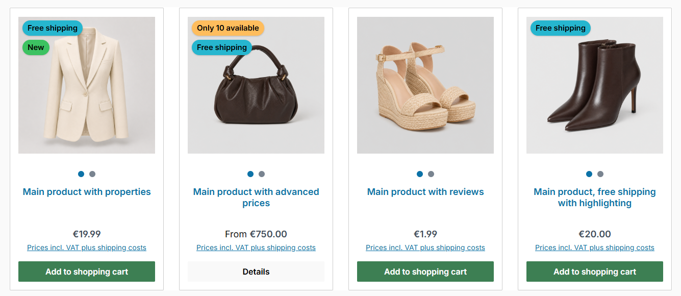
On touch devices, the dots below the image switch to the hover image
The dots only appear on touch devices and only for products with a hover image. On a computer with a mouse, everything stays as before. This works in the listing, in the list view, in compact mode and in product sliders.
Tab "Listing pages" => Block "Product box" => Section "Product image" => "Hover image on touch devices"
Changes in detail
Compatibility for Shopware 6.7.15 improved
From Shopware 6.7.15 onwards, the privacy notice below forms can additionally refer to the legal guarantee rights and the terms and conditions. For the newsletter subscription, Shopware hides this information, and ThemeWare® adopts this for its newsletter forms. The adjustment works with Shopware 6.7.14 and 6.7.15.
New layout type "integrated" for the search button in the header
The search button can now sit as a round shape inside the input field instead of joining it on the right. The input field runs on behind it, its corners follow the configuration "Corner type". Applies to the layout types "Input" and "Global Search".

The search button sits inside the input field
Tab "Header" => Block "Search" => Section "Basic configuration" => "Layout type (Button)"
New layout type "integrated" for the submit button of the newsletter widget
Like the search button in the header, the submit button of the newsletter widget can now sit inside the input field instead of joining it on the right. The input field runs on behind it, its corners follow the configuration "Corner type". The colours come from the colour configuration of the widget as before.
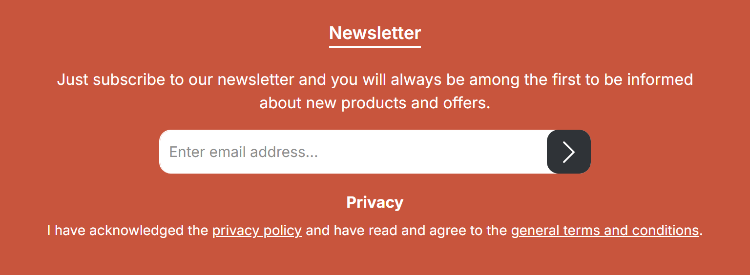
The submit button sits inside the input field
Tab "Widgets" => Block "Newsletter" => Section "Basic configuration" => "Layout type (Button)"
New layout type "Arrow (no area)" for the slider navigation arrows
Besides "Rectangle" and "Square/Circle", the navigation arrows now offer the layout type "Arrow (no area)". Only the arrow icon is visible, background, border and shadow are omitted, even if colours are set for them. The setting is available globally for all sliders and individually for image, gallery and product sliders.
Tab "Content" => Block "Sliders" => Section "Arrow navigation" => "Layout type"
New hover colours for the search button in the header
The search button in the header now has its own colours when hovering with the mouse: background, border and icon. By default, the background and border take on a darkened primary colour and the icon turns white. In the variants, the button fills with the primary colour.
Tab "Header" => Block "Search" => Section "Colour configuration" => "Background colour (Button) @hover", "Border colour (Button) @hover", "Icon colour (Button) @hover"
Please check your configuration: Until now, the search button only faded when hovering with the mouse. After the update, it takes on a colour, even if you change nothing. More on this below under "Notes".
New configuration for the spacing between products in the product slider
The space between the product boxes in the product slider can now be adjusted. By default, it stays at 30 pixels as before. A smaller value makes the slider look denser, and more products fit side by side.
Tab "Shopping Experiences" => Block "Product slider (Category 'Commerce')" => Section "Basic configuration" => "Spacing between products"
New configuration for the shadow of the elements on the product image
All elements on the product image of the product box now share one shadow: badges, wishlist and Quickview button and the rating on the image. You can choose "none", "subtle" or "strong", and the buttons become one step stronger when hovering with the mouse.
Tab "Listing pages" => Block "Product box" => Section "Product image" => "Shadow (elements on the product image)"
New configuration for the shadow of the slider navigation arrows
The navigation arrows of the sliders can now have a shadow, "subtle" or "strong". When hovering with the mouse, it becomes one step stronger. This makes the arrows stand out well on light images too. The shadow applies to the layout types "Rectangle" and "Square/Circle".
Tab "Content" => Block "Sliders" => Section "Arrow navigation" => "Shadow"
New configuration for the vertical position of the navigation arrows in the product slider
The navigation arrows in the product slider sit at half the height of the product box. With a lot of text below the image, they end up low in the image. With the new setting, they move up in steps from 50 % to as far as 30 %, for example to the middle of the product image.
Tab "Shopping Experiences" => Block "Product slider (Category 'Commerce')" => Section "Basic configuration" => "Vertical position (Navigation arrows)"
New option: navigation arrows in the hero slider inherit the configuration of the slider arrows
The hero slider has its own white arrows without an area. With the new option "inherit (theme configuration)", it uses the arrow configuration of the other sliders instead: layout type, colours, corners and shadow. This way, all sliders in the shop look consistent. By default, the hero slider stays as before.
Tab "Content" => Block "Sliders" => Section "ThemeWare® 'Hero slider' Pro" => "Navigation arrows in the hero slider"
Display of the cookie notice in the modal layouts improved
In certain configurations, the cookie notice in the modal layouts with overlay only appeared after a page change. The modal is now shown the same way as the banner, so the notice reliably appears on the first visit.
In addition, the keyboard focus moves straight into the notice when it opens. With the first press of the Tab key, your customers reach the link and the buttons.
Tab "Content" => Block "Cookie permission" => Section "Basic configuration" => "Layout type"
Accessibility of the headings in the footer improved
Screen readers now recognise the column headings in the footer as headings. This helps your customers using a screen reader find their way around the footer faster and jump straight to a column, for example the hotline or the newsletter. Nothing changes visually. For professionals: the headings of the footer elements now have role="heading" and aria-level="2", as in Shopware from 6.7.15.
Hover image in product boxes now also in the list view
In the list view, the hover image now appears like in the other layouts of the product box.
Hover effects "reduce opacity" and "scale image" in product boxes refined
Both hover effects now look calmer and more modern. "scale image" zooms the product image to 108 % and eases out gently, "reduce opacity" takes the image back to 80 %. If "Reduce motion" is active in the system settings, the zoom is omitted.
Tab "Listing pages" => Block "Product box" => Section "Product image" => "Hover effect"
Layout type "Full-width (borderless)" of the product image now also in the list view
With the layout type "Full-width (borderless)", the product image now also sits directly at the edge of the product box in the list view, just like in the other layouts. For this, the product box of the list view now has the same inner spacing as the other product boxes.
Tab "Listing pages" => Block "Product box" => Section "Product image" => "Layout type"
Navigation arrows in the product slider with overflow improved
When a layout type with overflow is active, the navigation arrows now sit on the edge between the last fully visible and the cropped product and reach slightly beyond it. This shows more clearly that there is more to see. On smaller screens, the arrows stay within the visible area. With the layout type "Arrow (no area)", the arrows are only slightly indented. Applies to the element setting "inside" of the navigation arrows and also to the CSS classes for individual CMS blocks.
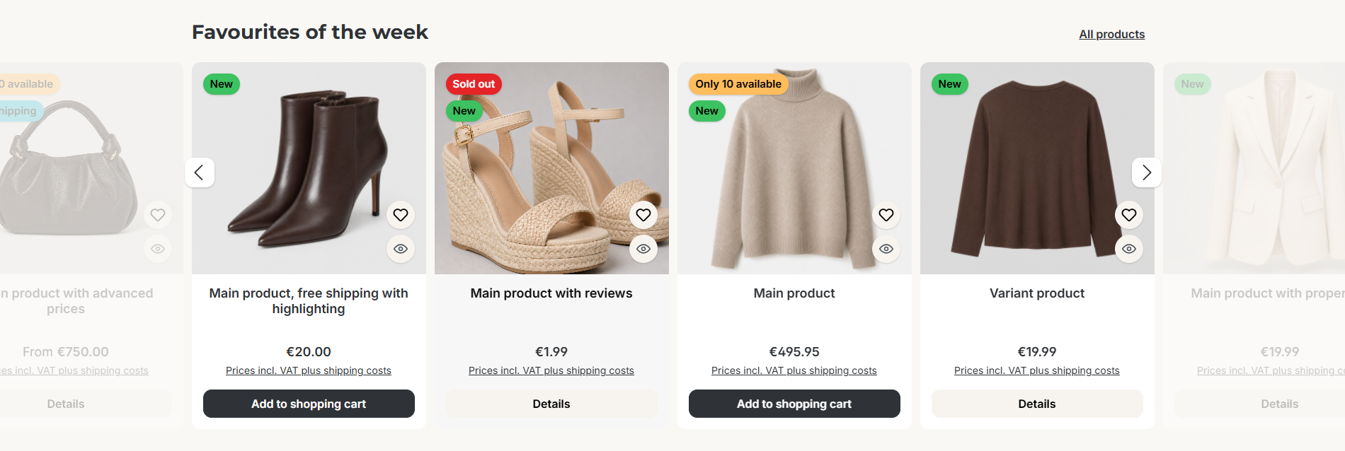
The navigation arrows sit on the edge to the cropped product
Tab "Shopping Experiences" => Block "Product slider (Category 'Commerce')" => Section "Design" => "Layout type"
"Dim products after clearance" now also in the list view
Sold-out clearance products are now also dimmed in the list view, just like in the listing and in product sliders.
Tab "Others" => Block "Beta" => Section "Product box" => "Dim products after clearance"
Bugfix: Sold-out badge and dimming now only apply to products without variants
For variant products, a product box in the listing often stands for several variants but only knows the stock of one of them. As a result, a product could be marked as sold out although other variants were still available. The sold-out badge and the dimmed display therefore now only apply to products without variants.
Bugfix: Notice on the legal guarantee rights now also opens in one page checkout plugins
With one page checkout plugins, for example "One Page Checkout" by PremSoft, the link to the legal guarantee rights on the order confirmation page now opens reliably again. For professionals: the dialog is now output at the end of the page (block base_pseudo_modal) and is therefore independent of the checkout structure.
Bugfix: Link to the manufacturer website now also works for web addresses starting with www
If the manufacturer's website is only maintained as a www address, for example www.manufacturer.com, the "Manufacturer website" link now reliably leads to the manufacturer's website. ThemeWare® automatically adds the missing beginning of the address, just like Shopware. The link also uses the translated website of the manufacturer now, and it no longer appears when no website is maintained.
Tab "Product pages" => Block "Manufacturer (in tabs)" => Section "Related manufacturer links" => "Show "Manufacturer website" link"
Bugfix: Screen readers now fully read out the cart button in the header
For the cart button in the header, screen readers now once again read out the number of items and the total amount.
Thank you very much for letting us know.
Bugfix: Numbers and arrows in the pagination are now centred
Since Shopware 6.7.13, page numbers and arrows in the layout type "Buttons" sat too high in the buttons, and in the layout type "Navigation" the arrows sat slightly too low. Both are now exactly centred.
Tab "Content" => Block "Pagination" => Section "Basic configuration" => "Layout type"
Notes
Cookie notice: wrapper "twt-cookie-permission-overlay-backdrop" of the modal layouts removed, please check your own CSS adjustments to it
In the modal layouts, the cookie notice used to sit in its own wrapper with the class twt-cookie-permission-overlay-backdrop. This wrapper no longer exists: the container .cookie-permission-container is now the background itself, and the box inside it (.row) is the modal.
This affects you if you added your own CSS for the class twt-cookie-permission-overlay-backdrop. Move it to .cookie-permission-container or to the box .cookie-permission-container .row.
Hover image: new default animation "crossfade with zoom" and toggle on touch devices, please check your configuration
If your shop uses the hover effect with a hover image, you will see two changes after the update: the image changes with the animation "crossfade with zoom", and on smartphones and tablets the row with the two dots appears below products with a hover image. The option in the hover effect is now called "hover image (Custom field)".
This affects you if you use the hover effect "hover image (Custom field)". To keep the previous behaviour, set "Animation (Hover image)" to "crossfade" and "Hover image on touch devices" to "don't show".
Product box: wishlist and Quickview button now have a subtle shadow like the badges, adjustable under "Shadow (elements on the product image)"
The badges in the product box have always had a subtle shadow. With the new setting for all elements on the product image, the wishlist and Quickview button get the same shadow, so everything looks consistent.
This affects you if you use the wishlist or Quickview button in the product box. If you want the buttons without a shadow, set "Shadow (elements on the product image)" to "none". The badges then have no shadow either.
Search button in the header now takes on the primary colour on hover, please check your configuration
Until now, the search button in the header only faded on hover. It now uses the new hover colours: without your own setting, the area and border take on a darkened primary colour and the icon turns white. This applies to the layout types "Input", "Flyout search" and "Global Search", the fullscreen search remains unchanged.
Tab "Header" => Block "Search" => Section "Colour configuration" => "Background colour (Button) @hover", "Border colour (Button) @hover", "Icon colour (Button) @hover"
This affects you if you use the search as input, flyout or global search. If you do not want a colour change, set "Background colour (Button) @hover", "Border colour (Button) @hover" and "Icon colour (Button) @hover" to the same colours as without @hover.