
ThemeWare® 5.3.0 is now available! 🎉 The new release includes the following changes:
Highlights
- 16 new icon sets with selectable style added
- New layout types for the configurator on the product detail page
- New designs and arrangements for the minimal footer in the checkout
- New designs and arrangements for the minimal header in the checkout
Changes
- Compatibility for Shopware 6.7.14 improved
- New button colour "Dark", e.g. for the wishlist button on the product detail page
- New setting for the look of the revocation button
- New "extend box" hover effects for the buttons in product boxes
- Accessibility of the discount badge improved
- Presentation of the quantity selection in product boxes improved
- Presentation of express checkout buttons such as PayPal on the product detail page improved
- "Shift content" hover effect in product boxes improved
- Quickview in the listing and checkout improved
- Icon buttons in the cart, checkout and on the product detail page displayed square
- Improved thumbnail selection and faster loading of the first row in the listing
- Top bar compatibility mode for extensions such as Shopware Commercial improved
- Bugfix: External links in the navigation without icon and without "noopener noreferrer" in additional languages
- Bugfix: Heart icon in the wishlist button on the product detail page sat too low
- Bugfix: Horizontal scrollbar on pages such as cart, checkout and customer account on small smartphones
- Bugfix: Buy button in the list view follows the product box settings
- Bugfix: Empty product tabs after a review when the reviews are shown in the accordion element
- Bugfix: Back button in the minimal header displayed incorrectly on small smartphones
Notes
- Arrangement "below each other" in the buy widget no longer applies with the compatibility setting "default"
- Icon settings moved to the new "Icons" block
- Twig templates for icons rebuilt, please check your own customisations of them
- Configurator: presentation and colour settings adjusted, "Show border" removed
- Minimal footer: presentation and settings adjusted, please check your configuration
- Minimal header: presentation and settings adjusted, please check your configuration
- Minimal header: "Fixed" removed, line and shadow now via "Design"
Highlights
16 new icon sets with selectable style added
With ThemeWare® 5.3.0 you can choose from 29 icon sets, 16 of them are new: Bootstrap Icons, Boxicons v3, Fluent UI System Icons, Font Awesome v7, Heroicons, Iconoir, Ionicons, Line Awesome, Lucide, Material Symbols, Phosphor, Simple Line Icons, Solar and Tabler, with Boxicons v3 and Solar also available as a variation.
An icon set swaps the symbols in your shop, from the cart in the header to the arrows in the slider. The new sets cover almost every icon in the storefront, Simple Line Icons the most common ones. If a set lacks a motif, the Shopware icon is drawn in that place, so your shop always stays complete.
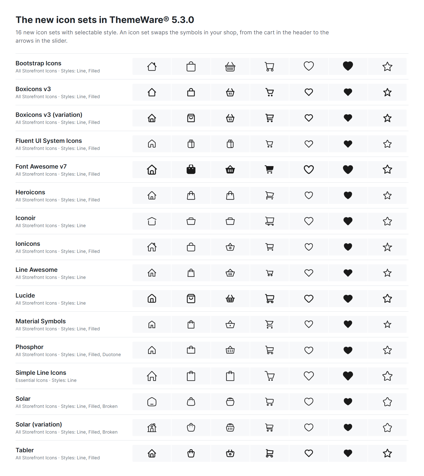
The 16 new icon sets at a glance
New settings come with them:
- Style: automatically the way the icon set is drawn, or specifically Line, Filled, Duotone (Phosphor) or Broken (Solar). If you are unsure, stay with "Automatic".
- Scope: only the spots ThemeWare® places itself (default), the Essential Icons or all storefront icons
- Stroke width: in five steps for Lucide, Tabler, Heroicons, Iconoir and Solar
Tab "Layout" => Block "Icons"
Tip: To make a new icon set visible everywhere in your shop, set the scope to "Essential Icons" or "All Storefront Icons".
You will find all icon sets and settings in detail in the manual: Icons and Iconsets in pictures.
- An icon set replaces the drawings behind Shopware's icon names. New names from the libraries, such as
fa-user, are not added. - Every replaced icon carries the CSS classes
twt-iconandtwt-iconset-<set>, plusis-regular,is-solid,is-duotoneoris-brokendepending on the style actually drawn. heartandstarstay the outline in every set,heart-fillandstar-fillthe filled version. That way the wishlist and ratings keep showing their state correctly, in other extensions too.
New layout types for the configurator on the product detail page
You can now design the variant selection, meaning colours, images and texts such as sizes, in six layout types: Outline, Outline with spacing, Outline with fill, Flat, Flat with underline and Underline. The selected layout type applies to all three types at once and adapts to each, so colours, images and texts look consistent together.
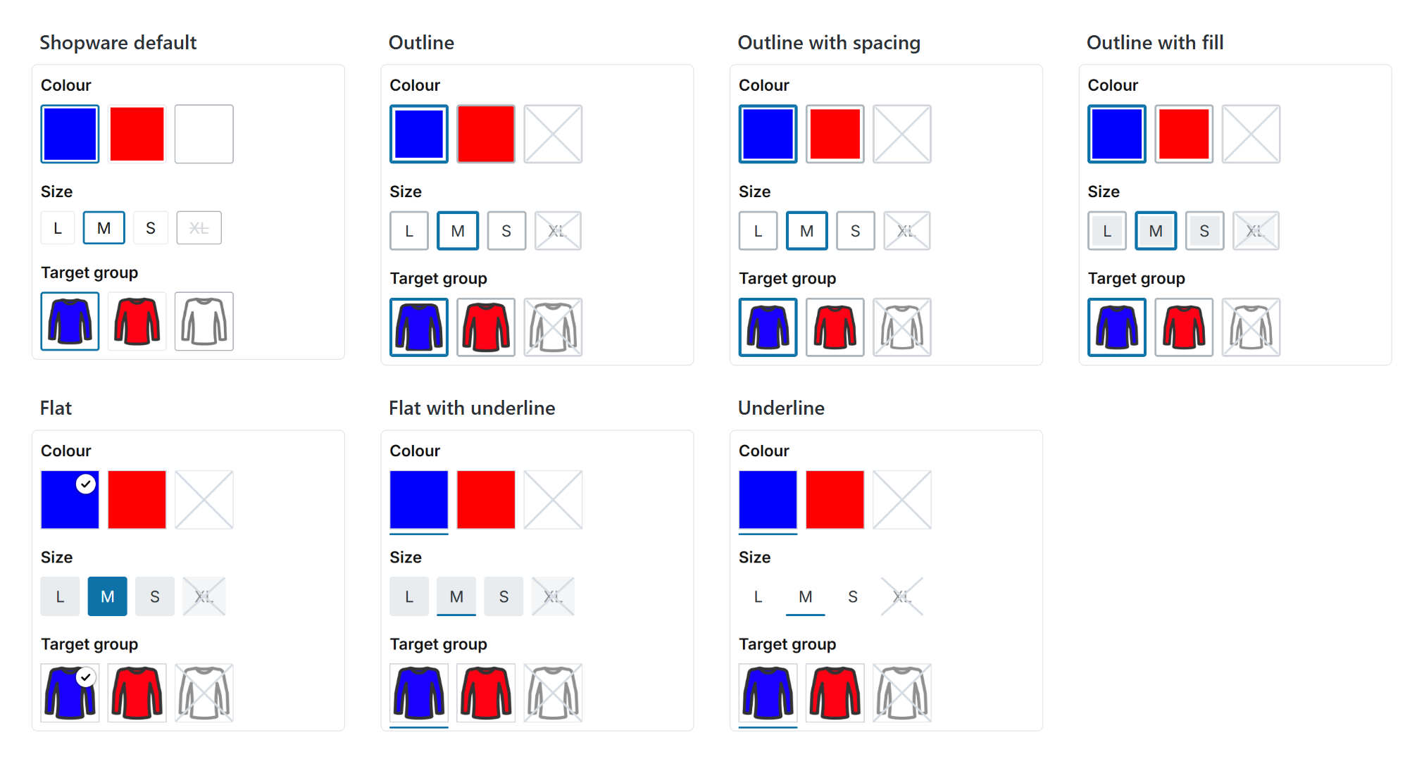
All layout types compared
New settings come with them:
- Border width: thin, normal or thick. It applies to the border and to the bar of the underline variants.
- Corner type: not rounded, rounded corners or round corners. With round corners, colours and images become circles and texts become pills.
- Colour (inner line): a fine line around colours and images in the layout types without a border, so that white colours and cut-out images stay recognisable.
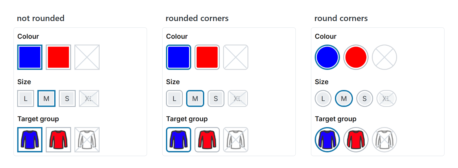
Corner type: not rounded, rounded corners and round corners
In addition, every option shows its name as a tooltip when you hover over it with the mouse or use the keyboard, unavailable options with the addition "(Unavailable)". The selected option also stands out clearly when its colour is similar to the border colour.
Tab "Product pages" => Block "Configurator (in the buy box)"
Tip: With "Shopware default" you see the configurator unchanged, as in Shopware. All other layout types use the ThemeWare® settings.
New designs and arrangements for the minimal footer in the checkout
In the checkout, meaning address, order overview and finish, your shop shows a slim footer with the legal notes. You can now design it to match the rest of your shop.
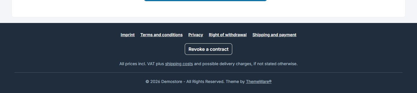
Minimal footer in the design "Surface" with divider
- Design: "Clean" without a surface of its own or "Surface", each optionally with a line on top
- Arrangement: "Below each other" with the revocation button above or below the service menu, or "Next to each other" with service menu and legal notes on the left, revocation button and copyright on the right
- Divider above the copyright and separate hover colours for the links

Arrangement "Next to each other"
Tab "Footer" => Block "Minimal footer (in the Checkout)"
Tip: The default colours are made for the dark default surface. If you choose "Clean", adjust the text and link colours.
New designs and arrangements for the minimal header in the checkout
The slim header in the checkout can now be designed freely as well, so that your customers can fully concentrate on the order and still recognise your shop.

Minimal header in the design "Surface with shadow"
- Design: "Clean" without a surface of its own or "Surface", each optionally with line or shadow
- Arrangement: "Standard" with centred text, "Grouped" with the text right next to the logo, both also with a coloured box, or "Simple" with only logo and button
- Logo: a separate logo for the checkout, width and height adjustable. If the field stays empty, you see your shop logo as before.
- Back button: with arrow icon, as Button or Button (outline) in your theme's button colours or with your own colours. "Shopware (default)" shows the button the way Shopware ships it.

Arrangement "Grouped (text next to logo, with divider)"
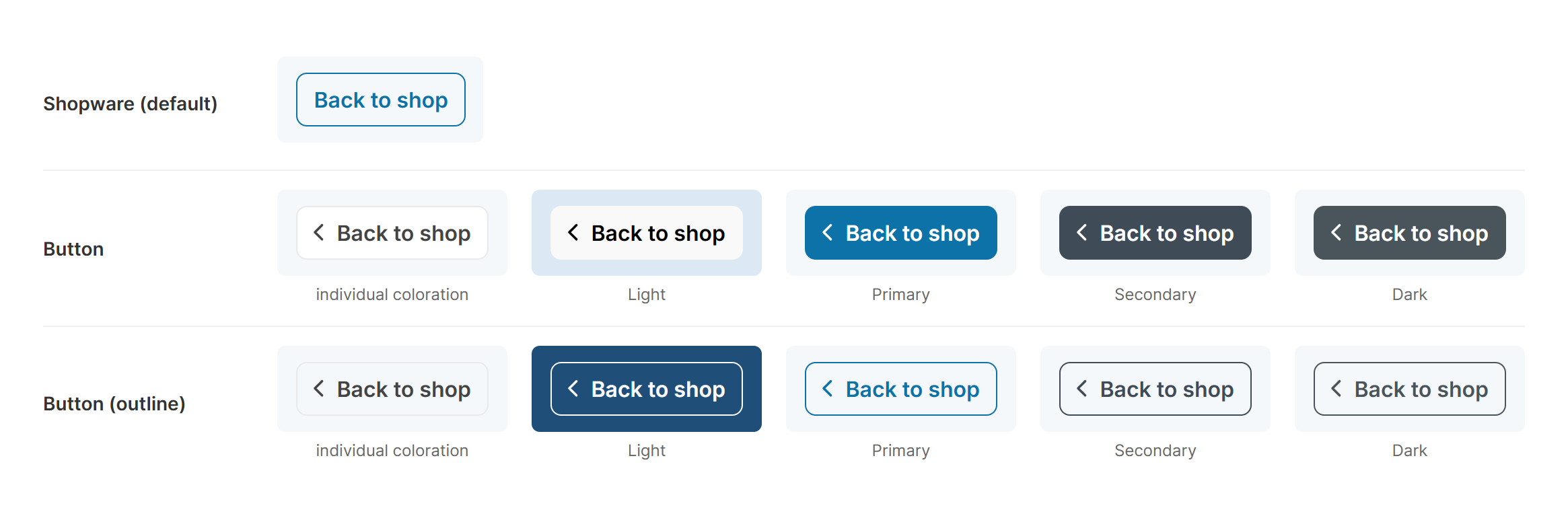
The back button in all layout types and button colours
Tab "Header" => Block "Minimal header (in the Checkout)"
- New template
storefront/layout/header/header-minimal.html.twig,storefront/layout/footer/footer-minimal.html.twighas been extended. - Design and arrangement are resolved when the theme is compiled. For the back button, "Shopware (default)" outputs Shopware's block unchanged.
- New SCSS mixins
twt-button-style()andtwt-button-size-sm()inthemeware/abstract/mixins/_button.scss, new variable$twt-sticky-box-shadowfor the shadow of the sticky navigation and the minimal header.
Changes in detail
Compatibility for Shopware 6.7.14 improved
Shopware 6.7.14 improves the accessibility of the product boxes and the product badges, and separates the cookie consent for Vimeo and YouTube videos. ThemeWare® adopts these changes.
You will mainly notice this with the product videos: if you enable the "Vimeo video" entry in the cookie dialog, the Vimeo videos on your product pages are released by it. Both providers now have their own consent.
New button colour "Dark", e.g. for the wishlist button on the product detail page
Next to the primary button, secondary button and light button there is now also a dark button. By default it has the same colour as in Shopware. You can select it for the wishlist button on the product detail page, the back button in the checkout and the revocation button.
Tab "Layout" => Block "Buttons" => Section "Colour configuration"
New setting for the look of the revocation button
You can now style the revocation button consistently everywhere, in widgets, footer elements and in the footer: as Button or Button (outline) in Light, Primary, Secondary or Dark. By default it stays the way Shopware ships it.
In the copyright footer and in the checkout footer it is shown subtly by default, as an outline in the link colour of the service menu. With "inherit (like the global setting)" it takes over the new setting there.
Tab "Layout" => Block "Buttons" => Section "Revocation button"
New "extend box" hover effects for the buttons in product boxes
With the three new hover effects "fade in", "slide up" and "slide down" (each "extend box"), the buy button, details button and quantity selection only appear when your customers move the mouse over a product box. The box is extended downwards: the buttons appear in an area below the box that lies over the next row. Nothing shifts, and the price and tax note always stay visible.
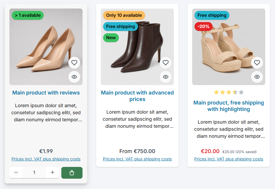
The buttons appear below the box, the price and tax note stay visible
"fade in" fades the area in, with "slide up" and "slide down" the buttons also glide into place from below or from above. Border, background and shadow of the box continue, so box and buttons look like one piece.
Tab "Listing pages" => Block "Product box" => Section "Action buttons (Buy / Details button)" => "Hover effect (Buy button / Details button)"
Note: The "extend box" effects do not apply in product sliders; there and on touch devices the buttons stay permanently visible. Below the listing there is some extra spacing so that the buttons of the last row have room.
- New values
6(fade in),7(slide up) and8(slide down) fortwt-product-box-action-buy-btn-hover. - The effect only applies on devices with a mouse (
(hover: hover) and (pointer: fine)), only in the listing (.cms-listing-col) and not in the list view. - With the keyboard the area opens via
:focus-within, and the box shows its hover look. Withprefers-reduced-motionthe movement of the buttons is dropped.
Accessibility of the discount badge improved
The discount badge now passes the actual discount value on to screen readers. In the layout types with descriptive text, such as "-20 %" or "20 % saved", the text is read out exactly as it is displayed.
The layout type with the plain percent sign keeps its text alternative "Discount", because there is no readable text in it.
Tab "Content" => Block "Product badges" => Section "Badge: Discount badge"
Presentation of the quantity selection in product boxes improved
The quantity selection in product boxes now brings its own arrangement instead of following the "Arrangement" setting of the product detail page. Quantity selection and buy button therefore look the same in every layout type of the product box, including the list view, which was excluded before.
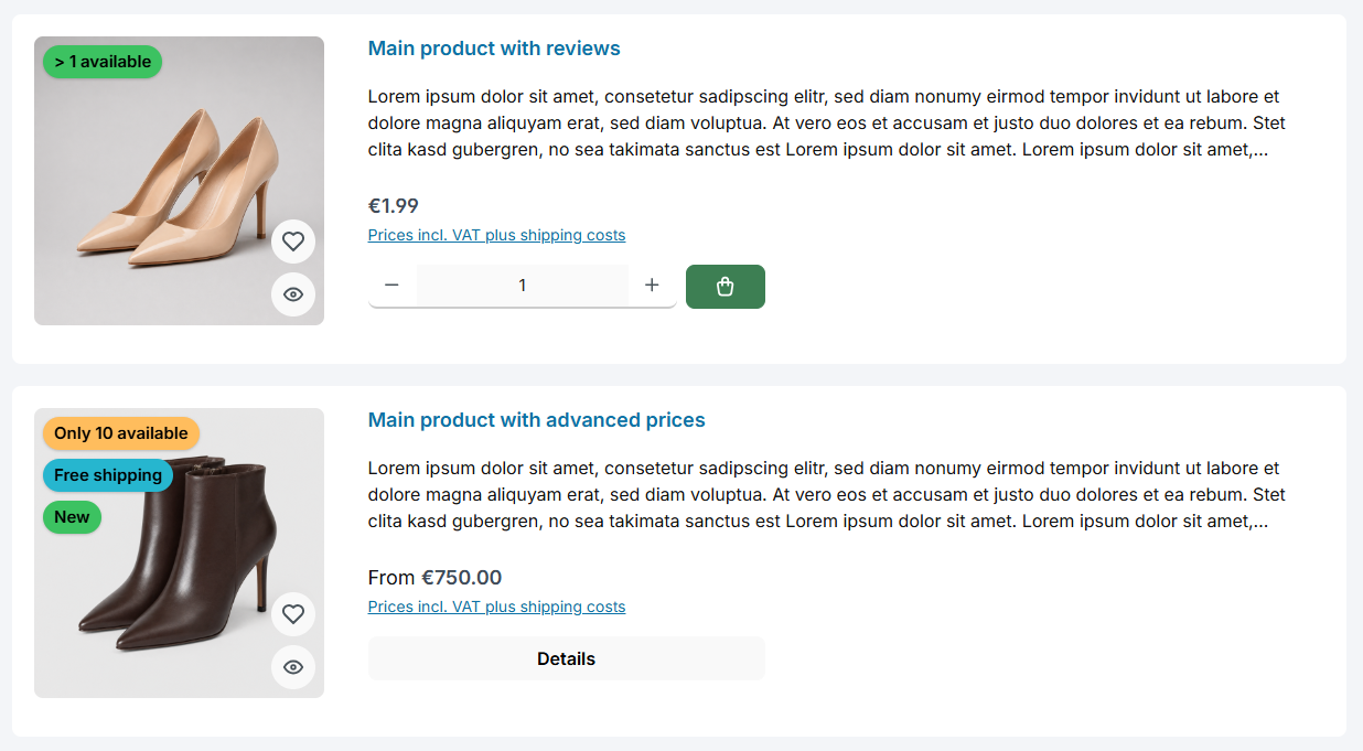
Quantity selection and buy button in the list view
When the product box gets narrow, for example with many columns, the quantity selection stays together as one unit and takes the full width; the buy button then moves to the next line, centred.
Tab "Others" => Block "Beta" => "Quantity selection (in product boxes)"
Presentation of express checkout buttons such as PayPal on the product detail page improved
Extensions such as PayPal or Amazon Pay add their own express checkout buttons below the buy button. In the arrangement "next to each other" they now sit left-aligned below the quantity selection and buy button and are at most as wide as the buy button can become. In certain configurations they could previously sit slightly offset from the buy button.
In the arrangement "below each other" the express checkout buttons line up flush with the buy button as usual.
Tab "Product pages" => Block "Buy box" => Section "Buy widget (Quantity selection and buy button)" => "Arrangement"
"Shift content" hover effect in product boxes improved
With the hover effect "slide up (shift content)", the image and text of the product box move up to make room for the buttons. The spacing between image and text is now kept, in both image layouts of the product box.
If the quantity selection is active, the effect now also adapts to narrow product boxes: the buy button becomes square there so that the quantity selection and button stay on one line. In very narrow boxes the buttons are permanently visible. That way the price and tax note stay free in any number of columns.
Tab "Listing pages" => Block "Product box" => Section "Action buttons (Buy / Details button)" => "Hover effect (Buy button / Details button)"
Tip: If you show express checkout buttons such as PayPal in the product box, use "no effect" or one of the "extend box" effects.
Quickview in the listing and checkout improved
The quickview in the listing and the product window in the cart, which opens from the image or the name of a line item, use the same Shopware function. So that each view fits its place perfectly, both are now separated: The quickview in the listing uses the ThemeWare® layout, the product window in the cart the Shopware presentation. You do not have to change anything for this.
At the same time we tidied up the presentation in both views. A manufacturer logo is now placed above the product name, a manufacturer name below it. The product name and the manufacturer are no longer underlined, the product number gets more spacing, and the header area of the window takes up less room.
Icon buttons in the cart, checkout and on the product detail page displayed square
Buttons that only show an icon, such as removing a line item, the quantity selection or adding a promotion code, are now square.
Improved thumbnail selection and faster loading of the first row in the listing
On category and search pages the browser now picks the thumbnails of the product images even more precisely to match their display size. In certain configurations, for example in a one-column listing on smartphones, a larger file than necessary could be loaded so far. This saves data and speeds up the page, without the images losing sharpness.
In addition, the first row of product images now loads right away and the first image with priority, as it is usually the largest visible element when the page opens.
You don't need to change anything. The improved thumbnail selection depends on the setting "Improve responsive images", which is active by default.
Tab "Others" => Block "Beta" => Section "Product box" => Configuration "Improve responsive images"
sizesreports an upper bound per breakpoint from the number of columns (100vw / images per row), capped at the container width in a boxed section. Images from the second row on additionally getsizes="auto", so current browsers measure the width themselves.- With
object-fit: coverthe aspect ratio of the image is taken into account (max(…, image box height × aspect ratio)), andautois left out there. - The first row is loaded with
loading="eager", the first image withfetchpriority="high". All product images getwidthandheightfrom the image data. - Affected is
storefront/component/product/card/box-standard.html.twig. Product sliders and cross-selling keep Shopware'ssizes.
Top bar compatibility mode for extensions such as Shopware Commercial improved
ThemeWare® 5.2.0 introduced the value ThemeWare® (plugin compatible) for extensions that take over the top bar, such as Shopware Commercial with the B2B context switcher. Hotline, service menu and the ThemeWare® styling are kept, and the content of the extension is embedded.
In this mode, the top bar configurations "Show language menu" and "Show currencies menu" now take effect as well. So far the extension brought its own language and currency switchers, and your settings for them had no effect. Now the top bar shows the language and currency switchers exactly as you configured them in ThemeWare®, and the B2B context switcher stays visible next to them. This also applies when the top bar is moved to the USP bar.
If you already use this value, you don't need to change anything.
Tab "Others" => Block "Compatibility (HC-Architecture®)" => Section "Header" => "Top bar"
- In this mode the content block
layout_header_top_bar_inneris called withheader.languages.countandheader.currencies.count= 1. Extensions that tie their language and currency switchers to these values leave them out, while other content such as the B2B context switcher is kept. - ThemeWare® includes the language and currency switchers directly via
layout/header/actions/language-widget.html.twigandcurrency-widget.html.twig, not via the blockslayout_header_top_bar_languageandlayout_header_top_bar_currency, which an extension can override. - Affected is
storefront/layout/header/top-bar.html.twig.
Bugfix: External links in the navigation without icon and without "noopener noreferrer" in additional languages
Categories of the type "Link" with an external address were not recognised as external links in additional languages if the link was only entered in the default language. This had two consequences:
- If the link opens in a new tab, the attribute
rel="noopener noreferrer"was missing. The page opened could therefore see that the visitor came from your shop. This affected the entire top navigation, meaning flyout, dropdown, flyout bar, flyout sidebar and flyout teaser. - In the flyout, the icon for external links was missing.
Now both work in every language. You can show the icon under "Others => Beta => Top navigation flyout => Show icon for external links".
- The link type of a category is translatable. The templates now read it via
category.translated.linkTypeand thus fall back to the default language. - Whether the link opens in a new tab was already determined by Shopware independently of the language. Modern browsers add
noopenertotarget="_blank"on their own, but notnoreferrer. - Affected are
layout/navbar/categories.html.twigas well as dropdown, flyout bar, flyout sidebar and flyout teaser underthemeware/extensions/twt-top-navigation-*.html.twig.
Bugfix: Heart icon in the wishlist button on the product detail page sat too low
In the layout types "Button" and "Button (outline)" the heart now sits centred next to the text.
Bugfix: Horizontal scrollbar on pages such as cart, checkout and customer account on small smartphones
Below a screen width of 576 px, the content of these pages stuck out one pixel past the edge, and the browser showed a horizontal scrollbar. This has been fixed.
Bugfix: Buy button in the list view follows the product box settings
The layout type "ThemeWare® List view (Beta)" belongs to the product boxes, and its buy button follows their settings, just like the other layout types. With the quantity selection enabled the button shows the icon only.
Tab "Listing pages" => Block "Product box"
Bugfix: Empty product tabs after a review when the reviews are shown in the accordion element
If your product page layout shows the description in the tabs and the reviews in the element "Product description & reviews (Accordion)", the content area of the tabs stayed empty when the product page was opened with the confirmation of a submitted review. Now the first tab is open there as usual.
If the reviews are in the tabs, the "Reviews" tab now reliably opens in this case, and only one tab content is visible at a time.
- Affected is
storefront/element/cms-element-product-description-reviews.html.twig. - Only when the page is opened with
?successafter a review do the link and content of the description and the reviews use the ThemeWare® markup. In all other cases Shopware's blocks are kept viaparent().
Bugfix: Back button in the minimal header displayed incorrectly on small smartphones
On narrow smartphones the "Back to shop" button turned into a narrow box with a quotation mark as arrow, and the text continued invisibly behind it. Now the button shows an arrow icon there. The text is kept for screen readers.
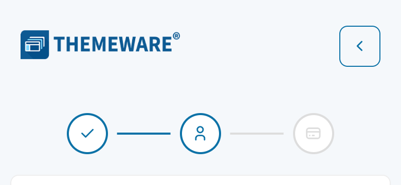
The back button on the smartphone
Notes
Arrangement "below each other" in the buy widget no longer applies with the compatibility setting "default"
With the compatibility setting "default", your shop shows the buy widget, i.e. quantity selection and buy button, the way Shopware ships it. This now also applies to the arrangement: the setting "below each other" only takes effect with the compatibility setting "ThemeWare®". That way "default" reliably gives you Shopware's presentation, for example when another extension adjusts the buy form.
Tab "Others" => Block "Compatibility (HC-Architecture®)" => Section "Product page" => "Buy widget (Quantity selection + buy button)"
This affects you if you have set "default" together with the arrangement "below each other": after the update, quantity selection and buy button are next to each other again. If you want to keep "below each other", set the compatibility to "ThemeWare®".
Icon settings moved to the new "Icons" block
The icon settings used to sit in the "Typography" block. They now have a block of their own:
Tab "Layout" => Block "Icons"
The filled variants of the existing icon sets are no longer separate entries. "Boxicons solid", "Boxicons solid (variation)", "ThemeWare® One solid" and "ThemeWare® Six solid" become the respective icon set with the style "Filled". "Boxicons" is now called "Boxicons v2". Your previous selection is switched over automatically during the update, you do not have to do anything.
In the Cloud Edition the saved selection is not switched over. Your shop still shows the same icons. If you select the icon set there again, also set "Style" to "Filled".
Twig templates for icons rebuilt, please check your own customisations of them
For the new icon sets we rebuilt the icon output. Two templates are affected:
storefront/utilities/icon.html.twighas been rewritten completely.storefront/themeware/twt-iconsets.html.twigis no longer used and is now an empty file. Every icon set now has a file of its own understorefront/themeware/iconsets/.
If you have overridden or extended one of these templates in a plugin or theme of your own, please check your customisation after the update.
Configurator: presentation and colour settings adjusted, "Show border" removed
With the new layout types, the previous style changes as well. Your selected layout type is kept during the update, but looks different in some details. Please take a look at a product page with variants after the update.
Tab "Product pages" => Block "Configurator (in the buy box)"
| What | Before | After |
|---|---|---|
| Name of the layout type | "ThemeWare®" | "Outline with spacing", the setting is kept |
| Name on mouse hover | standard browser tooltip | designed tooltip, also via keyboard |
| "Text option" => "Show border" | text options optionally without border | removed, text options always have a border in "Outline with spacing" |
| Background colour, @hover and @disabled | default "transparent", applied to text options | default #e9ecef, @hover #d3d9df, only applies to "Outline with fill", "Flat" and "Flat with underline" |
| Background colour @active and text colour @active | default "transparent" and #2b3136, applied to the selected option |
default primary colour and #ffffff, only apply to the selected text option in "Flat" |
This affects you if you set "Show border" to "no" or entered your own background colour or text colour @active. Your saved values are kept, but no longer apply in "Outline with spacing". For text options without a border choose "Underline" or "Flat with underline", for a coloured fill "Outline with fill" or "Flat".
Minimal footer: presentation and settings adjusted, please check your configuration
With the new designs the default look of the footer in the checkout changes as well. Please take a look at the address page in the checkout after the update.
Tab "Footer" => Block "Minimal footer (in the Checkout)"
| What | Before | After |
|---|---|---|
| Revocation button | filled primary button above the service menu | outline in the link colour of the service menu, below the menu |
| Empty service menu | empty space in the footer | no space |
| "Border-top colour (Copyright)" | without effect | now called "Divider colour" and applies with "Divider" => "with line" |
Minimal header: presentation and settings adjusted, please check your configuration
The header in the checkout also looks a little different after the update. Please take a look at the address page in the checkout.
Tab "Header" => Block "Minimal header (in the Checkout)"
| What | Before | After |
|---|---|---|
| Text | left of the centre | centred, visible on tablets from 768 px instead of 992 px |
| Logo | always 140 px wide, smaller logos too | at most 140 px wide (adjustable), smaller logos in their original size |
| Height | fixed height | minimum height, the header grows with its content |
Note: Your saved colours are kept, they now sit with the respective element. The colours of the back button are called "(Back button)" instead of "(Home button)" and apply with the button colour "individual coloration", the default.
Minimal header: "Fixed" removed, line and shadow now via "Design"
The setting "Fixed" no longer has a function, the minimal header now always scrolls along. You find it under "Others" => "Deprecated".
With "Fixed" the header used to get a line and a shadow automatically. You now set both via the design: "Surface with line" or "Surface with shadow".
Tab "Header" => Block "Minimal header (in the Checkout)" => Section "Design"