
ThemeWare® 5.2.0 is now available! 🎉 The new release includes the following changes:
Highlights
- Added new designs for the menu items and the header area of the offcanvas navigation
- Added a configuration for the size adjustment of fonts Feature-Request
Changes
- Compatibility for Shopware 6.7.14.0 improved
- Removed duplicate title attributes from logo, home and breadcrumb links
- Added the missing 600 (SemiBold) weight to the font "Roboto"
- Category links switched to the future Shopware interface
- Added a compatibility mode for extensions that take over the top bar (e.g. Shopware Commercial)
- Added a configuration for the button "Close menu" in the offcanvas navigation and cart
- Added a configuration for the position of the EU label GARAN in the buy box
- Added a configuration for the position of the revocation button in the footer Feature-Request
- Configurations that do not affect the design are no longer compiled
- Placeholder texts in the newsletter form adjusted to Shopware 6.7.14
- Added the fonts "Sen", "Lora", "Playfair Display" and "Source Serif 4"
- "Source Sans Pro" switched to its maintained successor "Source Sans 3"
- Linked logos now output an alt text
- Bugfix: On the product page and in the cart, the frame of the EU label GARAN was missing on the right and bottom edge
- Bugfix: The "Custom announcement" is shown again on product pages
- Bugfix: Wishlist icon in product boxes centred
- Bugfix: Top bar overlapped the action buttons in Header 2.1 when the hotline was enabled
- Bugfix: Fixed the image linking in the "Awards, seals or certificates" widget
Notes
- The header area of the offcanvas navigation now uses the ThemeWare® arrangement. Please check how your mobile navigation looks.
- The placeholder in the newsletter widget now comes from a ThemeWare® snippet.
- The font "Roboto" now uses the 600 (SemiBold) weight for bold text instead of falling back to 700 (Bold). Please check whether you like the slightly lighter look.
- If you use our extension "EU guarantee label and GARAN", please update it as well. Only from its version 1.0.0 do the guarantee label and the footer entry follow the positions selected in the theme.
Highlights
Added new designs for the menu items and the header area of the offcanvas navigation
The offcanvas navigation is the menu that slides in from the side on phones and tablets. For many of your customers it is the main way through your shop - yet there was very little you could change about how it looks. With 5.2.0 it gets a configuration of its own under Tab "Content" => Block "Offcanvas navigation".
Four designs for the menu items are available under Section "Design":
- Shopware (default) - the familiar list with separator lines
- List (Clean) - the same list without lines and a little more airy
- Buttons (compact) - surfaces with separator lines between them
- Buttons - individual surfaces with rounded corners
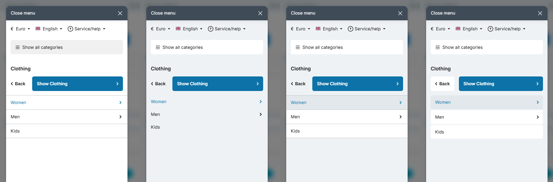
On top of that come colours of their own for the menu items, the panel and the separator lines, a typography setting and a glass effect for the background - the same one you already know from the flyout of the top navigation.
The header area has been rebuilt. Until now "Show all categories" and "Back" sat there as separate rows one below the other, while the way into the open category was hidden at the start of the list. Now "Back" and "Show category" sit side by side as a pair of buttons, right below the name of the category. The way in is as easy to hit as the way back.
If you prefer the familiar arrangement, set Section "Basic configuration" => "Layout type (category buttons)" to "Shopware (default)". The colour and typography settings work there too. One difference remains: "Show category" is a list entry again in that arrangement and therefore takes the colours of the menu items. The button "Show all categories", on the other hand, looks the same in both arrangements - it is no menu item, stays fully configurable and keeps exactly the inset you set under "Margin left/right".
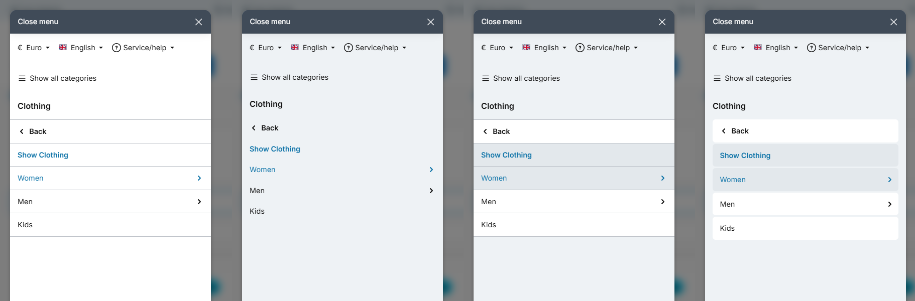
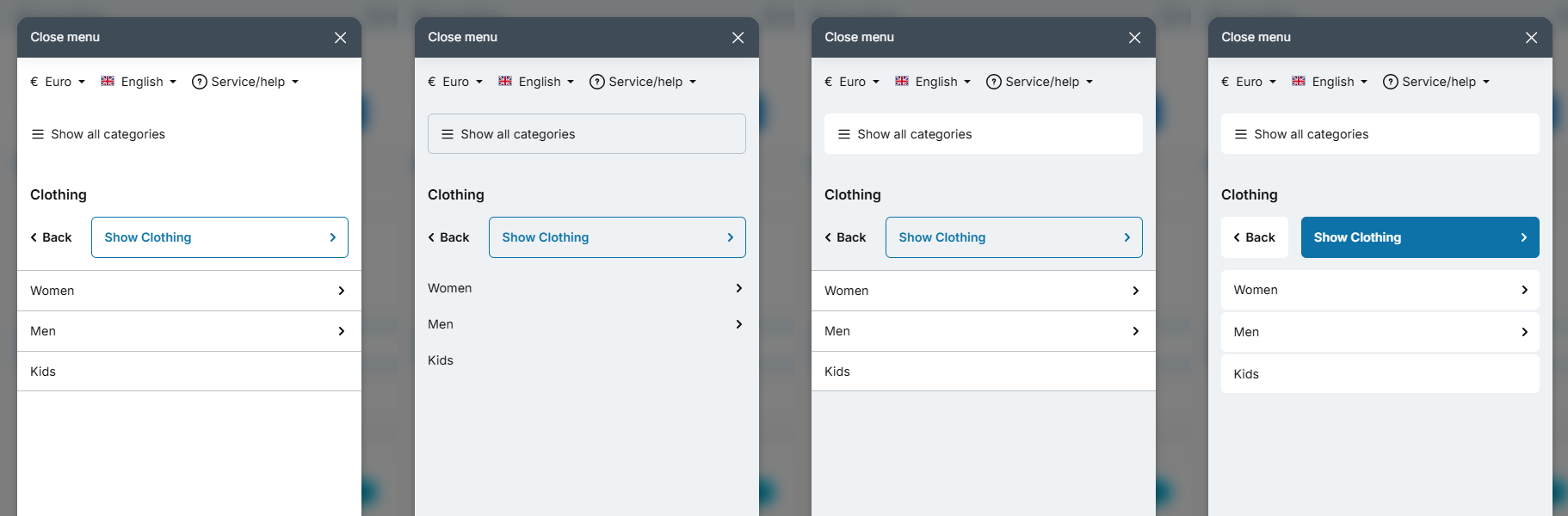
Both buttons can be styled separately. In the sections "Button "Show all categories"" and "Button "Show category"" you pick a layout type and the colours for each: a filled button, an outline button with a border or - for the upper one - no surface at all, as a plain link.
"Show category" comes filled in your theme colour by default. It is the main action of the menu, and it may stand out. Its hover colour is calculated from your theme colour, so it follows along automatically when you change it.
Added a configuration for the size adjustment of fonts Feature-Request
Not every font looks the same size at the same font size. Some typefaces draw their letters lower, some narrower than others and therefore look smaller, although nothing is wrong with the font size. Until now, the only option in such a case was to adjust every font size individually.

With the new size adjustment you scale the font itself instead - without touching a single font size. There are two fields, one each for the "Text" font and the "Headlines" font:
Tab "Layout" => Block "Typography" => Section "Text" => "Size adjustment"
Tab "Layout" => Block "Typography" => Section "Headlines" => "Size adjustment"
The value belongs to the font, not to the role: it applies everywhere that font appears in your shop. If you enter the same font in both fields, there is only one font and therefore only one value: whichever field you filled in is the one that counts; if both fields hold different values, the one from the "Text" section applies. The default is 100, meaning no adjustment - nothing changes in your shop unless you enter something. Values from 75 to 125 are possible.
You can find more information about the fonts in ThemeWare® in the ThemeWare® Manual:
An example: the font Englebert, which ThemeWare® Bio uses for its headlines, runs considerably narrower than other fonts and therefore looks small. At a value of 115 it sits on a par with the other theme fonts. You will find reference values for all bundled fonts in the manual.
The size adjustment scales the letters, not the areas around them - a button or a badge keeps its height, the text inside it grows. The width does grow along with it, so after a change please check buttons, badges and the navigation for labels that start to wrap.
The size adjustment affects the fonts that ThemeWare® bundles and loads locally from your server - with one exception: "Inter" comes from Shopware itself, so it is not covered. The same goes for an enabled "Import Google Fonts" and for fonts you add via custom CSS.
Changes in detail
Compatibility for Shopware 6.7.14.0 improved
From Shopware 6.7.14 onwards, the shop shows the new EU guarantee label GARAN in the buy box as soon as a manufacturer guarantee is maintained on the product. We have aligned ThemeWare® with it so the label fits neatly into the structure of the buy box.
Removed duplicate title attributes from logo, home and breadcrumb links
Several links carried a title attribute that merely repeated what could already be read: the shop logo in the header and in the sticky navigation, the home entry of the main navigation and the two home links in the breadcrumb.
Screen readers announce a link by its name. If a title with the same wording sits next to it, some programs announce both. The name now comes from where it belongs: from the image alt text for the logos, and from the visible text for the other links.
One exception stays on purpose: if you show the home entry of the main navigation as an icon instead of text, the link contains nothing readable. There, a separate label remains so the link keeps a name.
Shopware took the same route with 6.7.14 and removed the title from the shop logo as well.
Added the missing 600 weight to "Roboto"
The font "Roboto" was shipped without its 600 (SemiBold) weight, even though the file was included. Since ThemeWare® uses 600 for "bold" by default, the browser fell back to 700 (Bold) instead.
The 600 is now available. Bold text in Roboto therefore looks slightly lighter than before - this affects the ThemeWare® Bio, Global and Strong variants as well as any shop using Roboto. If you prefer the heavier look, set the "bold" font weight to 700.
Category links switched to the future Shopware interface
Shopware offers themes two ways to determine the address of a category - an older helper function and the category data itself. The older function will be removed with Shopware 6.8. We have therefore switched ThemeWare® to the future approach everywhere: in the top navigation and all flyout variants, in the service menu of the footer, in the category teaser elements as well as in the subcategory lists and the sidebar navigation.
Nothing changes for your shop. Categories with an external link, an internal link or a landing page still point exactly to their configured target, and links that should open in a new tab continue to do so. Both ways return the same result - the new one simply keeps working after the move to Shopware 6.8.
Added a compatibility mode for extensions that take over the top bar
Some extensions replace the content area of the top bar entirely - Shopware Commercial has been doing so since version 7.13 for the B2B context switcher. Hotline, service menu and the ThemeWare® styling of the bar are lost. How this shows and how to check whether you are affected is described in the article "Top bar or service navigation missing after an update".
With 5.2.0 there is a third value in the compatibility configuration of the top bar:
Tab "Others" => Block "Compatibility (HC-Architecture®)" => Section "Header" => "Top bar"
Set it to ThemeWare® (plugin compatible) and hotline, service menu, colours and alignment of ThemeWare® are kept, while the content of the extension - such as the B2B context switcher - is embedded where the language and currency switchers sit.
The value has to be chosen deliberately. Shops without such an extension stay on the previous value ThemeWare® and will not notice any difference.
Added a configuration for the button "Close menu"
At the very top of the offcanvas navigation and the offcanvas cart sits the button "Close menu". How it looked was fixed until now. With the new configuration you decide for yourself.
Tab "Content" => Block "Offcanvas (Cart & navigation)" => Section "Button "Close menu""
Under "Layout type" you choose between "Button" - a filled surface with a separator line and a soft shadow below it - and "Link", which shows only text and icon. The link is more restrained and lets the eye move on to the actual content sooner. "Background colour" sets the surface. The theme derives the text colour and the hover effect from it, just like for the other buttons.
The default is "Button" in the colour of your secondary button - exactly how it looked before. So nothing changes unless you want it to.
The setting applies to both places alike. The filter panel in the category view brings a close button of its own and stays untouched.
Added a configuration for the position of the EU label GARAN in the buy box
The new configuration lets you decide whether the label is displayed above or below the product specifications. The default is below.
Tab "Product pages" => Block "Buy box" => Section "Guarantee (GARAN label)" => "Position"
Would you like more influence on how the EU labels are presented? Our add-on EU Harmonised Notice & Label (GARAN) offers additional options:
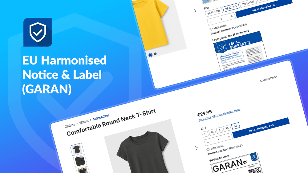

EU Guarantee Notice & GARAN
From 27 Sept 2026, every B2C product page without the EU label is open to formal complaints. Guarantee notice in 24 languages plus the GARAN warranty label – live in 10 minutes.
- Guarantee notice in 24 languages
- GARAN warranty label straight from the admin
- Local, no SaaS – updates included
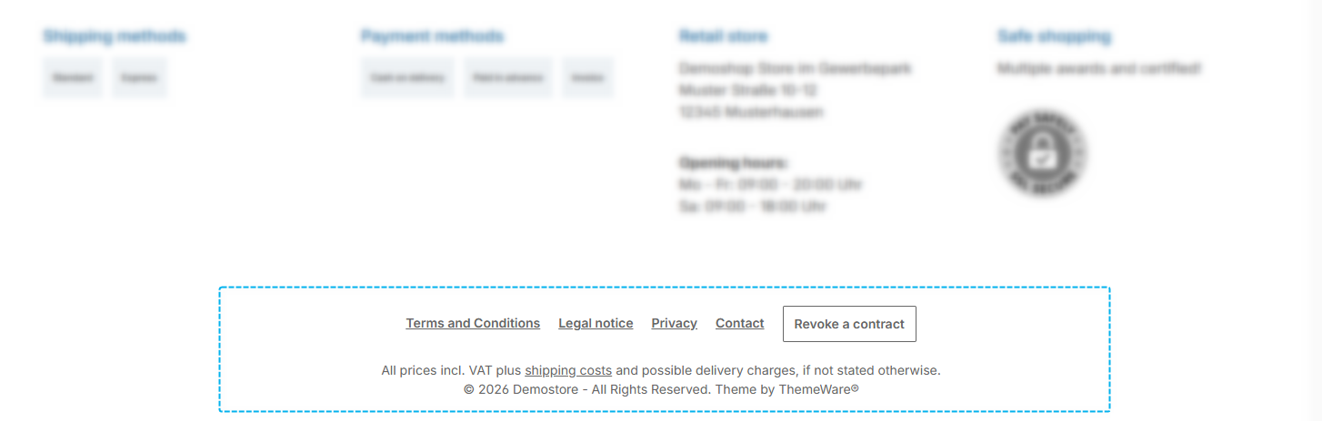
Added a configuration for the position of the revocation button in the footer Feature-Request
When the revocation button is enabled in the Shopware settings, it is displayed inside the "Service hotline" widget; alternatively, the separate footer element "Revocation" has been available since ThemeWare® 5.0.1. The new configuration now also lets you move the button to the footer bottom. There it appears as a compact button within the service navigation row and stays visible even when the service navigation is hidden for the respective screen size. The default is the display inside the service hotline.
Tab "Widgets" => Block "Service hotline" => Section "Revocation button" => "Position"
If you use the footer element "Revocation", that element still takes precedence.
Configurations that do not affect the design are no longer compiled
Not every configuration in the Theme Manager affects the appearance of your shop: many only control whether something is displayed or where it appears. Until now, these configurations were processed on every theme compilation as well. We have sorted out 264 of them, so that only what actually produces styling is processed during compilation.
This changes neither your settings nor the presentation in your shop. Individual configurations that already had no function are now additionally marked with a note in the tooltip.
Placeholder texts in the newsletter form adjusted to Shopware 6.7.14
With version 6.7.14, Shopware removes the placeholder texts from the form elements - the grey example texts shown inside an empty input field. The reasoning: every field already carries a visible label above it, so the placeholder only repeats it. This affects the newsletter, the contact and the revocation form.
For the newsletter widget in the footer this would have been a step backwards. There the input field and the button sit together as one compact row and the label of the email field is hidden, which makes the placeholder the only visible hint. ThemeWare® therefore provides it itself from now on, via a new snippet:
twt.widget.newsletter.placeholderMail(default:Enter email address...)
In the newsletter form of the shopping experiences the labels are visible above the fields. There we follow Shopware: the example texts for "First name" and "Last name" are removed.
Added the fonts "Sen", "Lora", "Playfair Display" and "Source Serif 4"
Four new fonts are now available in every ThemeWare® theme. All four are loaded locally from your server - an import via the Google Fonts API is not required.
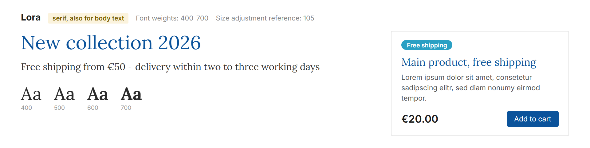
- Lora - a calm serif that stays readable in body text as well. Weights 400, 500, 600, 700.
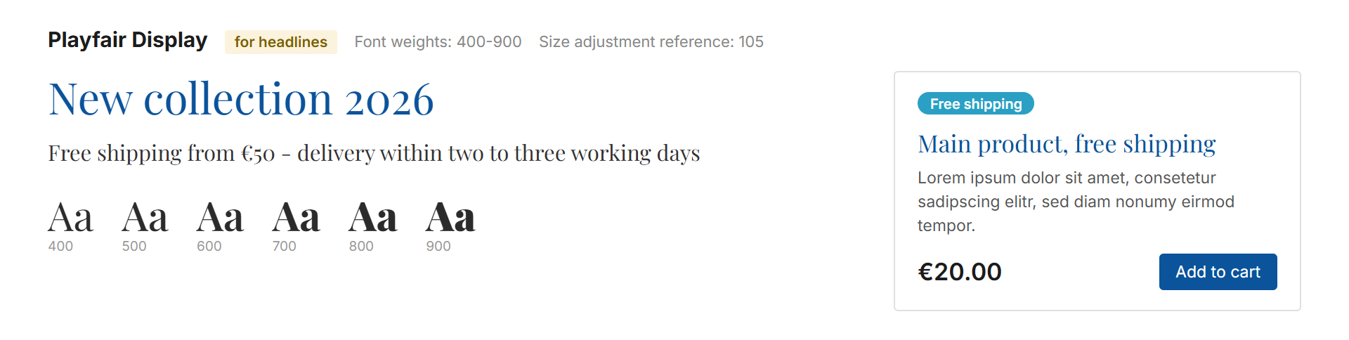
- Playfair Display - a high-contrast serif for headlines, the kind you know from fashion, cosmetics and jewellery. Weights 400, 500, 600, 700, 800, 900.
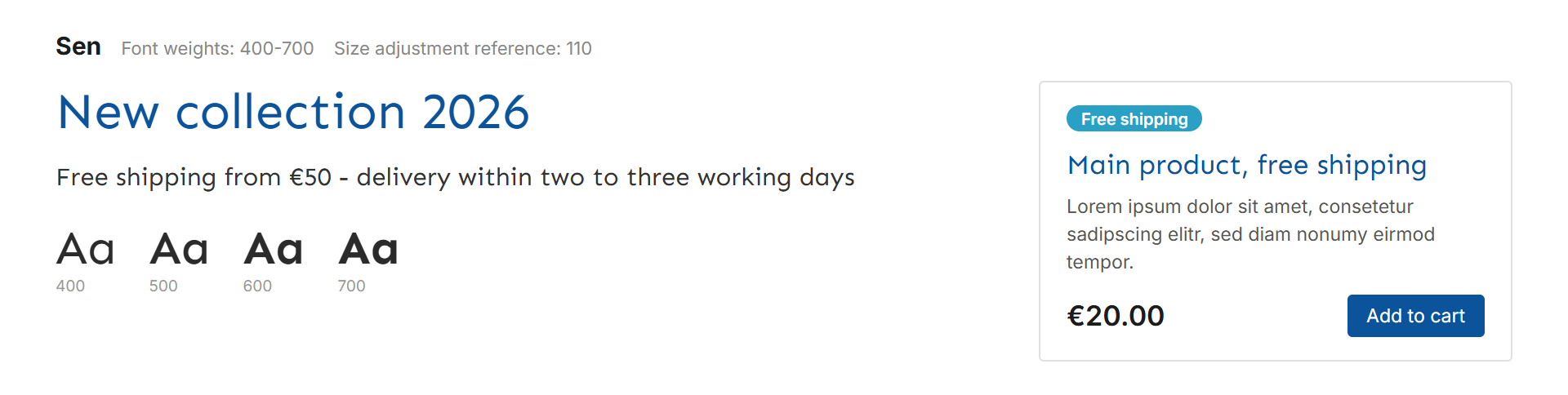
- Sen - a clear, friendly sans serif. Weights 400, 500, 600, 700.
- Source Serif 4 - a matter-of-fact reading serif by Adobe, designed to match Source Sans. Weights 300, 400, 500, 600, 700.
With Lora, Playfair Display and Source Serif 4 the theme has proper serif typefaces for the first time - until now Roboto Slab was the only font heading in that direction.
You can enter them in the font fields as 'Lora', serif, 'Playfair Display', serif, 'Sen', sans-serif and 'Source Serif 4', serif.
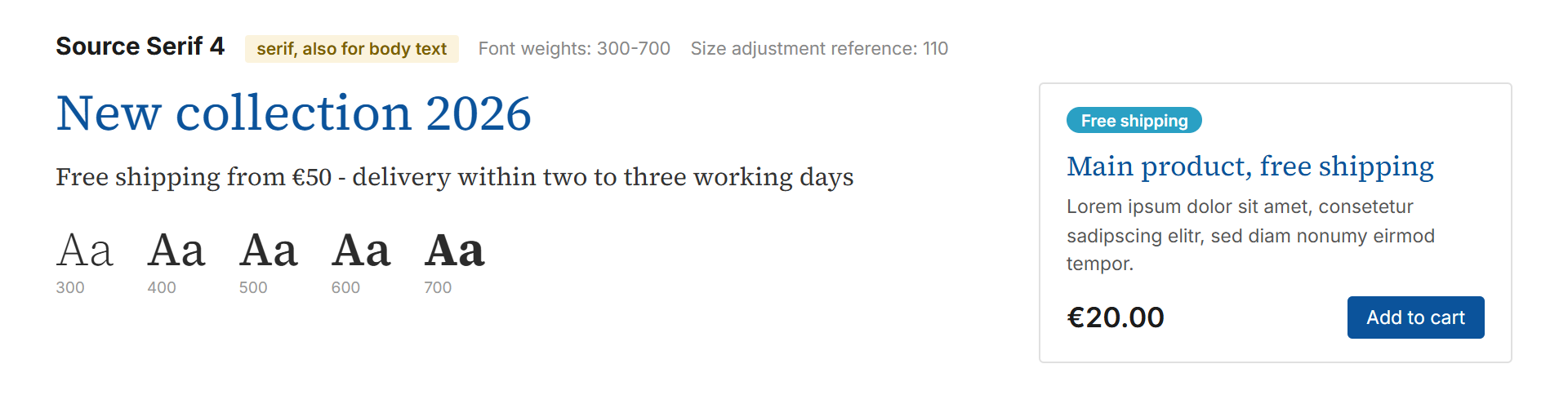
You can find more information about the fonts in ThemeWare® in the ThemeWare® Manual:
https://docs.themeware.design/more-knowledge/fonts
"Source Sans Pro" switched to "Source Sans 3"
Adobe has retired the font "Source Sans Pro"; it is no longer listed on Google Fonts. Its successor is "Source Sans 3" - the same design, still maintained, with one additional weight (500 Medium).
Both names remain usable. If you keep using 'Source Sans Pro', sans-serif, ThemeWare® serves the Source Sans 3 files for it - letterforms, advance widths and line breaks stay identical, nothing changes in your shop. For new shops, 'Source Sans 3', sans-serif is the value to use. The ThemeWare® Bike, Fit, Living and Plants variants have already been switched.
Linked logos now output an alt text
If your logos are linked, the alt attribute of the images used to remain empty. It now contains a text that describes the destination of the link. This matches the approach Shopware uses for the shop logo in the header.
This strikes a good balance between SEO tools, accessibility and screen readers: SEO tools no longer stumble over an empty alt attribute, the label remains fully readable in the HTML, and screen readers announce exactly one text as before instead of reading it twice.
The change affects the following widgets:
- Shipping logos
- Payment logos
- Awards, seals or certificates
For the shipping and payment logos, the text is composed using two new snippets:
twt.widget.shipping.linkAlt(default:Shipping information about %name%)twt.widget.payment.linkAlt(default:Payment information about %name%)
The placeholder %name% is replaced by the alt text of the respective logo. In the widget "Awards, seals or certificates", the existing snippet for the link description is used instead. Without linking, everything stays as before.
Bugfix: The frame of the EU label GARAN was missing on the right and bottom edge
Shopware ships the GARAN label as a finished graphic. Its frame is a line that sits exactly on the edge of the drawing area. At the size the label appears in the shop, the outer half of that line fell outside the rendered area - the frame was missing on the right and at the bottom, and the label looked open on two sides.
ThemeWare® now draws the frame around the graphic itself, in the same colour. The prescribed graphic remains untouched. This affected the product page and the line items in the cart.
Bugfix: The "Custom announcement" is shown again on product pages
Since version 5.1.0 the "Custom announcement" was no longer rendered on product pages as soon as the delivery information appeared in the ThemeWare® layout, which is the default setting. It is now shown below the delivery information in the buy box again, regardless of the compatibility option "Delivery information (in the buy box)". The announcement in the checkout was not affected.
Bugfix: Wishlist icon in product boxes centred
The heart in the round wishlist button of the product boxes and the X for removing on the wishlist page sat 3 pixels too low. The cause was an older correction that had compensated for the offset of an earlier button layout and was left over after the button got its fixed size. It has been removed, both icons are now exactly centred.
Bugfix: Top bar overlapped the action buttons in Header 2.1 when the hotline was enabled
In Header 2.1 the top bar and the action buttons share one row. Without a hotline the top bar therefore always started on the left - with the hotline enabled, however, the configured "Text alignment" applied, and with the default value "right" the top bar ended up underneath the buttons. The top bar in Header 2.1 now always starts on the left, regardless of the hotline. The configuration "Text alignment" has no effect in this header type, and the help text now says so.
Bugfix: Fixed the image linking in the "Awards, seals or certificates" widget
With the option "linked with snippet" no link was created when the "URL" field was empty. The address from the snippet is now used.
Notes
The header area of the offcanvas navigation now uses the ThemeWare® arrangement
The new header area is active by default. After the update the top of your mobile menu therefore looks different than before, even if you change nothing: "Back" and "Show category" sit side by side as a pair of buttons, and "Show category" is filled in your theme colour.
The list of menu items below stays unchanged as long as you keep the design "Shopware (default)".
Would you like the familiar arrangement back? Two changes under Tab "Content" => Block "Offcanvas navigation" are enough:
- Section "Basic configuration" => "Layout type (category buttons)" to Shopware (default)
- Section "Button "Show all categories"" => "Layout type" to Outline button, and "Background colour" to
#bcc1c7
After that "Back" and "Show category" sit one below the other again, the category name carries the regular text colour, and the button at the top is light with a border again. Everything else is already right.
"Roboto" now uses the 600 weight for bold text
The file for the 600 (SemiBold) weight was part of the theme but never registered. Since ThemeWare® uses 600 for "bold" by default, the browser fell back to 700 (Bold) instead. From 5.2.0 the 600 is actually used - bold text in Roboto therefore looks slightly lighter, without you changing anything.
This affects the ThemeWare® Bio, Global and Strong variants as well as any shop using Roboto. If you prefer the heavier look, set the "Font weight (bold)" configuration to 700:
Tab "Layout" => Block "Typography" => Section "Font weight" => "Font weight (bold)"
The placeholder in the newsletter widget now comes from a ThemeWare® snippet
Until now, the placeholder in the email field of the newsletter widget came from the Shopware snippet newsletter.placeholderMail. Because Shopware removes it with 6.7.14, ThemeWare® provides it via twt.widget.newsletter.placeholderMail as of 5.2.0.
If you had customised or translated the Shopware snippet, your version is no longer used. In that case, transfer it to the new snippet once. If you never changed the text, there is nothing to do: the default text is the same as before.
Please update the extension "EU guarantee label and GARAN" as well
As of 5.2.0, ThemeWare® decides for itself where the GARAN label sits in the buy box, and it takes the guarantee notice of our extension along to the same place. Theme and extension coordinate with each other for this - and that coordination only exists from version 1.0.0 of the extension onwards.
So please update it together with the theme. The guarantee notice and the GARAN label then sit together at the position you choose here:
Tab "Product pages" => Block "Buy box" => Section "Guarantee (GARAN label)" => "Position"
From 1.0.0 onwards, the footer entry of the extension follows the position selected in the theme as well.