
ThemeWare® 5.1.0 is now available! 🎉 The new release includes the following features and changes:
Highlights
- New image animations added to the hero slides Pro
- New styles added for the flyout and the dropdown navigation of the top navigation
- New "Product safety information" tab for the GPSR information Feature-Request
- New "Config Finder" feature for searching the theme configuration added Pro
- New "Delivery information in the product box" feature added Feature-Request
- New "Product slider with overflow" feature added
- New "Product symbols (notice images)" feature added Feature-Request
- New "Product Safety (GPSR)" feature added Feature-Request
- New "Shipping link" feature added
- Properties added to "Product description & reviews (Accordion)" Pro
- Manufacturer added to "Product description & reviews (Accordion)" Pro
- Custom field "Manufacturer information (GPSR)" added Feature-Request
- Custom field "Responsible person (GPSR)" added Feature-Request
Changes
- Compatibility for Shopware 6.7.13.0 improved
- New animations added for the flyout and the dropdown navigation
- New display options added for the rating in the product box
- New background colours added for the menu items in the flyout and the dropdown navigation
- New "Arrangement" configuration added for the quantity selection and the buy button
- New "Arrangement" configuration added for the product rating in the buy box
- New "Description text" configuration added for the Data sheets, Downloads, Properties and Videos tabs
- New "Layout type" configuration added for the wishlist button on product pages
- New configuration for the HTML tag of the description heading added Pro Feature-Request
- New "Link description" configuration added for the full-area link of the CMS elements Pro
- New "Placement" configuration added for the product rating on product pages Feature-Request
- New "Show product rating" configuration added for the buy box on product pages Feature-Request
- New "Drop shadow" configuration added for the flyout and the dropdown navigation
- New "Columns" configuration added for the flyout with cards
- New option "Keep sections open" added to the "Product description & reviews (Accordion)" CMS element Pro Feature-Request
- New option "Show as list on mobile" added to the "Product description & reviews (Accordion)" CMS element Pro Feature-Request
- New position "bottom left" added for the wishlist button on the product image
- New positions added for the rating in the product box
- New position choice added for the Quickview button on the product image
- New position choice for product page sections added
- New slots above and below the product name added to the product box
- New "Button style" added to the "Product description & reviews (Accordion)" CMS element Pro
- New glass effect added for the panel of the flyout and the dropdown navigation
- New hover effect added for the product badges, rating, wishlist and Quickview button on the product image
- New "slide in" hover effect added for the arrow navigation of the sliders
- New "%manufacturer%" placeholder added for the headlines of the manufacturer and GPSR tabs
- New "Star style" added for the review stars Feature-Request
- New "Compact" style added for the product specifications in the buy box Feature-Request
- Unified the spacing of the elements in the buy box
- Unified the spacing of the badges, wishlist and Quickview button on the product image
- The "List in columns (Shopware 5)" style now only applies to the flyout
- The animation of the flyout now also applies to the dropdown navigation
- Properties configuration bundled in the new Block "Properties table (in tabs)"
- Improved the focus rings for keyboard navigation Feature-Request
- Manufacturer configuration bundled in the new Block "Manufacturer (in tabs)"
- In the list view the product image is linked again Feature-Request
- Moved the "Show subheadline" configuration to Block "Properties table (in tabs)"
- Improved the delivery information on product pages
- The maximum height now takes precedence over the maximum width in the "Awards, seals or certificates" widget
- Modal, offcanvas, cookie notice and fullscreen search now respect the "Reduce transparency" system setting
- Reworked the product box in the list view: product image, badges and buttons are now aligned consistently
- Improved feedback, news and links in the ThemeWare® Hub
- Improved the performance of the sticky top navigation
- Bugfix: Animations of CMS blocks are no longer played in modals
- Bugfix: CMS elements are only fully linked when a URL has been set Pro
- Bugfix: The "Custom content" is no longer shown when the custom field is empty Pro
- Bugfix: The sticky top navigation now appears exactly when the navigation reaches the top of the screen
- Bugfix: The sticky top navigation is released again when the window is resized below the configured minimum width
- Bugfix: The sticky top navigation reserves the correct height again after the window has been resized
- Bugfix: The sticky top navigation no longer shifts the page content when it appears and disappears
- Bugfix: The "Reduce motion" system setting now also switches off the animations of the CMS blocks and the submenu
- Bugfix: Fixed duplicate block names in the configuration of some CMS elements Pro
- Bugfix: Fixed an incorrect title fallback and missing German help texts for custom fields
- Bugfix: Fixed the help text of the headline configurations in various CMS elements Pro
- Bugfix: The wishlist and Quickview buttons are round again in the list view
- Bugfix: Sticky sections no longer get stuck on mobile devices
- Bugfix: Variants and other buttons now respond again on touch devices when tapped for the first time
Notes
- The dropdown navigation now uses the colours of the submenus instead of the colours of the top navigation
- Configuration key of the flyout style changed
- Configuration and template files of the delivery information on product pages updated
- Configuration and template files for tabs on product pages updated
- Template structure of the CMS teaser elements unified Pro
- Subheadlines and subtitles on product pages now use unified CSS classes
Tip: Create a backup before updating and test the update in a staging environment. This makes it easier to migrate template customizations and changed configurations.
Note: For more details on the new and updated features, please refer to the ThemeWare® Manual. We have updated and expanded it accordingly.
Note: The configuration and the template files for tabs on product pages have been updated. In addition, the template structure of the CMS teaser elements has been unified. – Please review your configuration and any individual template customizations after the update.
Highlights
New image animations added to the hero slides Pro
The slides of the "Hero slider" can now animate their image subtly, making them feel much more lively. Via the new "Animation (Image)" configuration you choose per slide between "Zoom" (the image slowly grows), the classic Ken Burns effect (the image slowly grows and shifts slightly – either "Ken Burns (bottom left)" or "Ken Burns (top right)") and "Parallax (on mouse move)" (the image subtly follows the mouse movement). The animation restarts with every slide change.
The configuration is available in all three slide elements and is applied in the "Cover" display mode. The parallax effect is disabled on touch devices; the operating system setting "Reduce motion" is respected by all image animations.
New styles added for the flyout and the dropdown navigation of the top navigation
The submenus (flyouts) of your main navigation can now be styled far more freely. The flyout gets the new "Buttons" style: every category receives its own surface with rounded corners instead of a plain line of text. The existing styles remain and are now called "List (Shopware 6)", "List" and "List in columns (Shopware 5)".
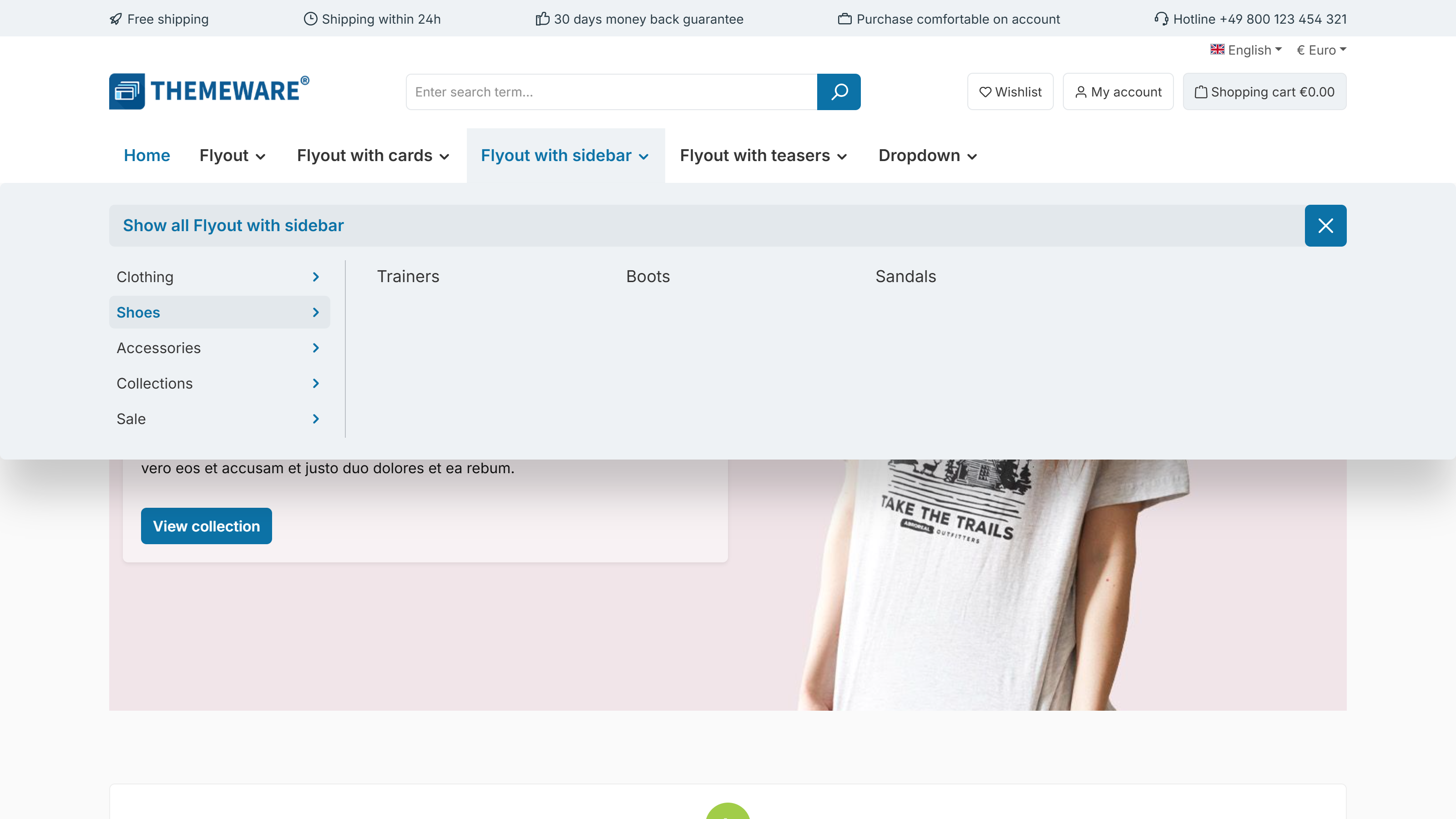
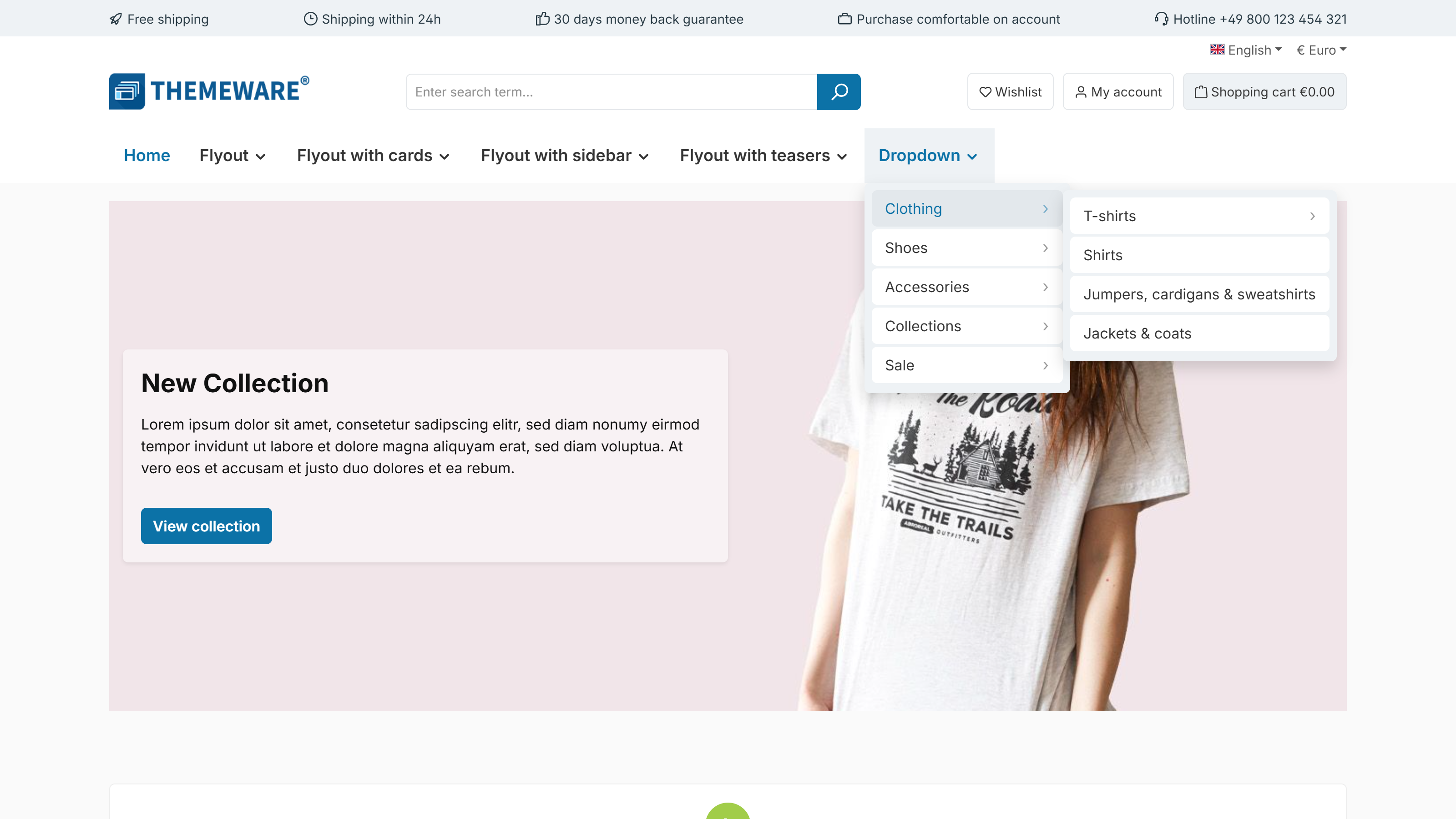
The dropdown navigation has received its own style selection as well: "List" shows plain text without surfaces and without separator lines, "Buttons (compact)" gives every menu item a surface across the full width of the card, and "Buttons" insets the surfaces with rounded corners into the card.
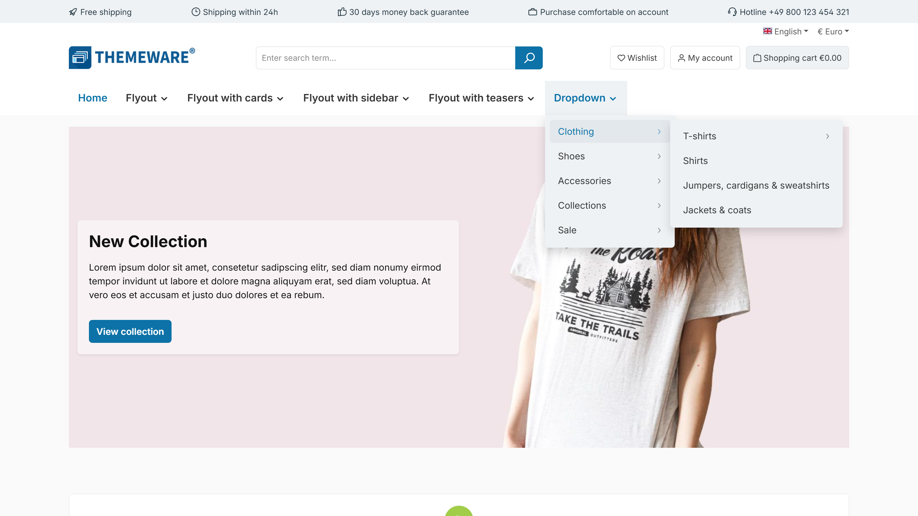
Both style selections have moved into the new "Design" section, where they are simply called "Flyout" and "Dropdown navigation":
Tab "Header" => Block "Top navigation flyout" => Section "Design" => configurations "Flyout" and "Dropdown navigation"
Your previous value is migrated automatically during the update (Pro Edition); you will find the previous configuration "Flyout style" for reference in Tab "Others" => Block "Deprecated".
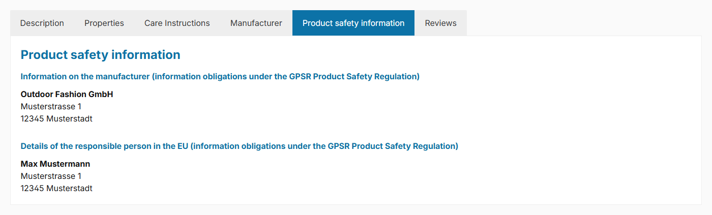
New "Product safety information" tab for the GPSR information Feature-Request
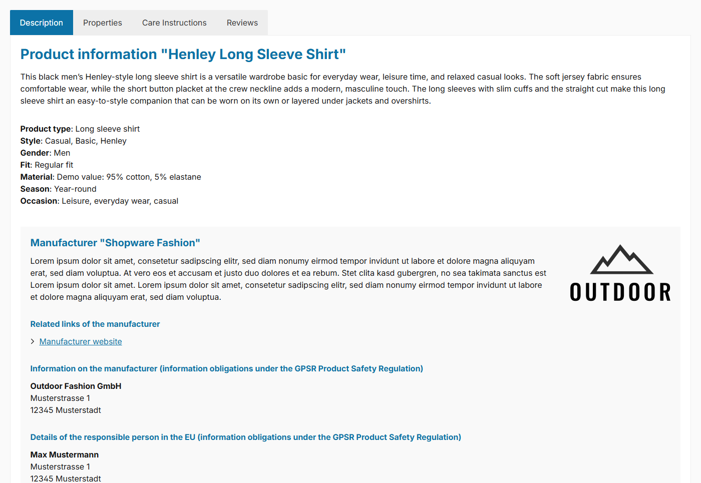
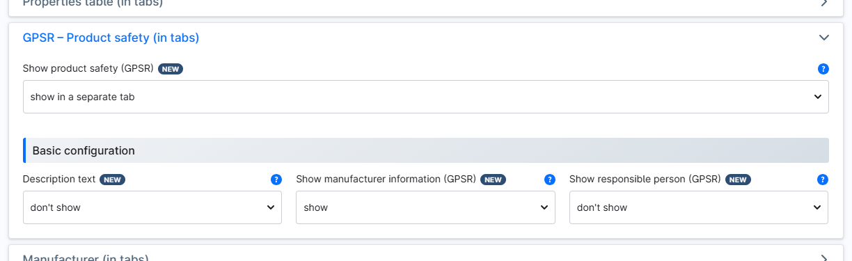
The GPSR details (manufacturer information and responsible person) can now optionally be shown in a dedicated "Product safety information" tab on the product page.
Tab "Product pages" => Block "GPSR – Product safety (in tabs)" => configuration "Show product safety (GPSR)" => option "show in a separate tab"
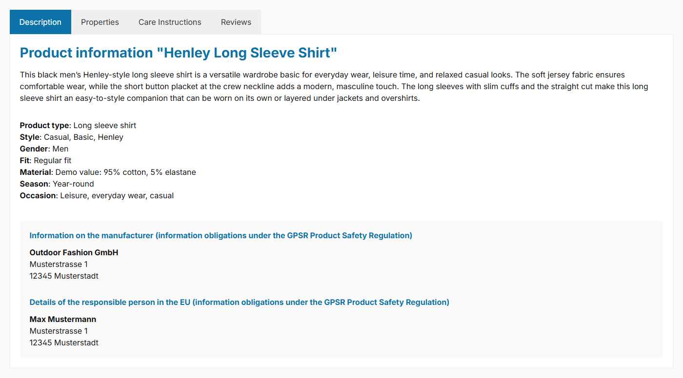
Alternatively, they can be integrated into the manufacturer tab or the product description.
New "Config Finder" feature for searching the theme configuration added Pro
ThemeWare® 5.1.0 adds more than 50 further configurations. So that you keep finding what you are looking for in all that choice, we have moved our Config Finder to where it makes the most sense: straight into the theme manager – exactly where you then change the setting.

We have been working on this search for several months. We deliberately held it back until the ThemeWare® Hub and the Backup Manager were finished – only with those two in place does it add up to what we had in mind: find, change and back up your settings, all in one place. With ThemeWare® 5.1.0 the moment was right. The field search engine in the browser of course remains available alongside it.
A click on "Config Finder" in the top right of the theme manager opens the search field. As you type, ThemeWare® hides everything that does not match: only the cards and fields belonging to your search term remain, and tabs without results disappear from the tab bar. Each remaining tab shows how many results it holds. You therefore see at a glance where the setting you want lives – and can change it right away.
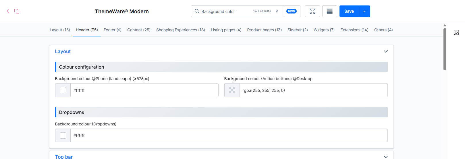
The search covers both the labels of the settings and their technical names (twt-header-type, for example) – so you also find again what is mentioned in the documentation, in the changelog or in a support reply. A match on a card title shows the complete card: searching for "Header" takes you to the whole area instead of a single field. Several words narrow it down further, it starts from two characters, and Esc closes the search field again.
Tip: The Config Finder is also available in the admin search bar. Pick the search type "ThemeWare® Config Finder" there and you can find configuration fields from anywhere in the administration – clicking a result opens the theme manager with the search already applied.
Tip: A "New" button sits right next to the Config Finder. One click reduces the theme configuration to exactly those fields this update added – so after the update you can walk through everything new one by one, without having to search for it. A search term narrows that selection down further.
New "Delivery information in the product box" feature added Feature-Request
"Available, delivery time: 1-3 days" – so far this information was only shown on the product page. You can now display it in the product box as well, right above the price. Your customers therefore see in the listing whether a product ships immediately, is sold out or can only be pre-ordered – without having to open every product first.
You choose the appearance from four layout types: "Text" is the plain line with a coloured dot, "Label" puts it on a matching tinted surface, "Badge" turns it into a pill in the style of your product badges, and "Chip" shows just a coloured dot with the text sliding out from behind it on hover.
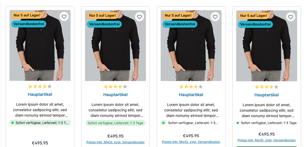
By default the product box is set to "like the product page" – so you configure the appearance once and both areas match automatically. If you prefer, you can of course style the product box differently.
Tab "Listing pages" => Block "Product box" => Section "Delivery information"
Thank you very much for this suggestion.
New "Product slider with overflow" feature added
Until now, a product slider ended abruptly at the edge of its container – you could not tell whether there was anything behind it. Now you can have the neighbouring products displayed cropped. This shows your customers at a glance that there is more to see and invites them to browse on.
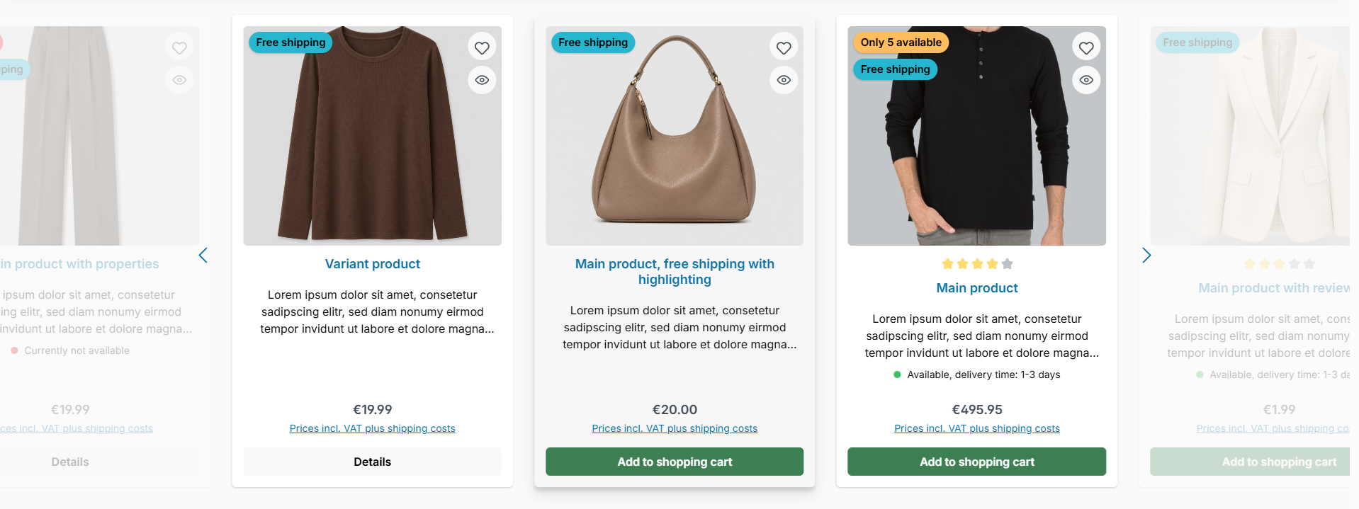
Using the "Layout type" you can choose between "Peek" (the neighbouring products appear inside the container), "Overflow" (they extend beyond the container) and both combined. You define the width of the crop separately for desktop and mobile devices. If you like, the cropped products are dimmed, so the focus stays on the fully visible products.
You do not have to commit to one setting for your entire shop: using a CSS class on the CMS block you can display individual product sliders differently – and the other way round too, keeping a single slider at the Shopware standard even though a layout type is active globally.
Tab "Shopping Experiences" => Block "Product slider (Category 'Commerce')" => Section "Design"
New "Product symbols (notice images)" feature added Feature-Request
With the new "Product symbols" you display seals, care instructions, certificates and more as small symbols directly on the product page. The symbols can be maintained in two ways – individually or combined: centrally via properties with an image (activate the new custom field "Show as product symbols" on the property group and select your images) or individually via three custom fields in the corresponding product ("Symbol 1–3", each with an optional title).
You choose the position via the new "Show product symbols" configuration: below the product images (gallery), above or below the product specifications (buy box), in the description, in the properties tab or in a separate "Symbols" tab. The "Style" ("Icons (side by side)", "Icon with text" or "Icon list") automatically adapts to the selected position when set to "Standard (recommended)". Optionally, you can add a description text (from a snippet and/or custom field) and a subheadline.
Tab "Product pages" => Block "Product symbols" and Block "Tab 'Symbols'"
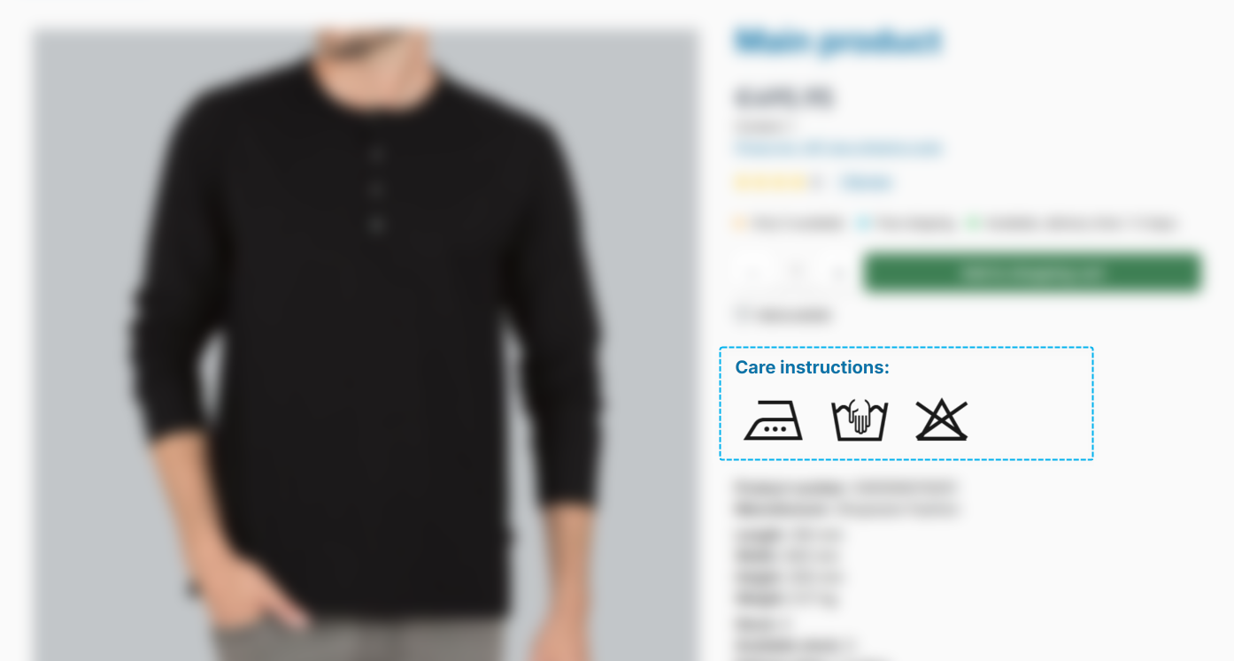
Tip: In the Pro edition, the "Symbols" section is also available in the "Product description & reviews (Accordion)" CMS element.
Thank you very much for this suggestion.
New "Product Safety (GPSR)" feature added Feature-Request
With ThemeWare® 5.1.0 you can maintain and display the information required by the EU General Product Safety Regulation (GPSR) directly in the theme – without an additional plugin. Two new custom fields ("Manufacturer information" and "Responsible person") are available for this, which can be maintained both on the manufacturer and on the product. The information can be positioned flexibly: in a dedicated "Product safety information" tab, in the manufacturer tab or in the product description. You will find the details of the individual building blocks in the following sections.
Tab "Product pages" => Block "GPSR – Product safety (in tabs)" => configuration "Show product safety (GPSR)" => option "show in the description"
Thank you very much for this suggestion.
New "Shipping link" feature added
A shipping link can now be shown below the buy button. A click opens the shipping and payment information page configured in your shop as an overlay – so your customer stays on the product page.
You write the text freely via the snippet twt.detail.shippingLink, preset to "Free shipping from 50 €". For products flagged as free of shipping costs the link is hidden automatically – the "Free shipping" label is already shown there anyway.
Tab "Product pages" => Block "Buy box" => Section "Shipping link"
Important: If you state a threshold in the snippet ("Free shipping from 50 €"), it has to apply to all delivery countries of your shop. Shopware manages shipping costs per shipping method, currency and rule – a snippet cannot tell those apart. If you deliver under different conditions, phrase the text neutrally, for example "Shipping costs & delivery times".
Properties added to "Product description & reviews (Accordion)" Pro
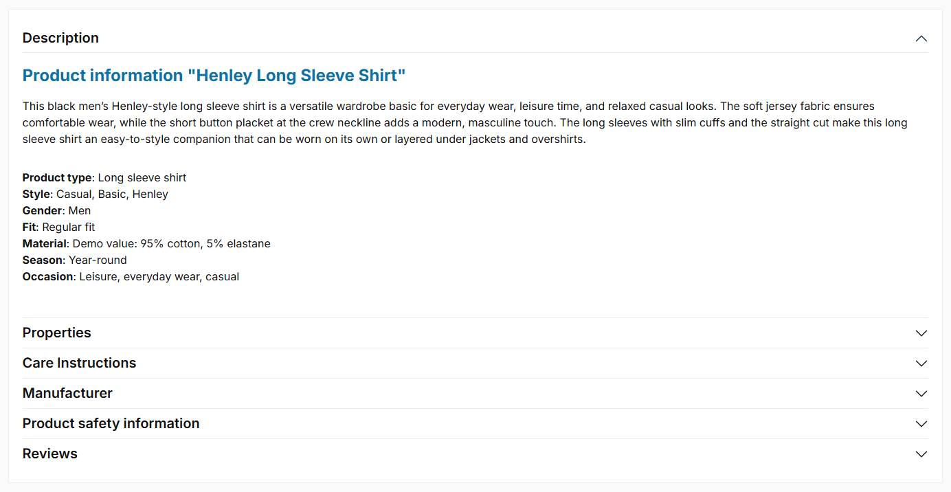
The CMS element "Product description & reviews (Accordion)" can now also display the "Properties" section. The section can be activated in the element configuration and shows the product's properties table as its own section. This requires the properties to be shown as their own tab in the theme configuration – otherwise they appear in the description (theme-controlled) and the toggle has no effect.
Manufacturer added to "Product description & reviews (Accordion)" Pro
The CMS element "Product description & reviews (Accordion)" can now also display the "Manufacturer" section. The section can be activated in the element configuration and shows the same content as the manufacturer tab – including the new GPSR information.
Custom field "Manufacturer information (GPSR)" added Feature-Request
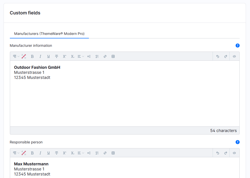
The new custom field "Manufacturer information" allows you to maintain the manufacturer details required by the EU General Product Safety Regulation (GPSR): name or registered trade name, full postal address and an electronic contact address.
The custom field is available on the manufacturer as well as on the product – a value maintained on the product overrides the value of the manufacturer. Depending on the configuration, the information is displayed in the "Description" tab, in the manufacturer tab or in the new GPSR tab and can be activated in the theme configuration.
Note: The EU General Product Safety Regulation (GPSR) requires merchants to display information about the manufacturer and the responsible person in the EU directly with the product. Many of you asked to maintain and display this information directly with ThemeWare® – without an additional plugin. This release makes it possible. If you are already using a specialised GPSR plugin, you can of course continue to use it – simply leave the ThemeWare® display disabled.
Custom field "Responsible person (GPSR)" added Feature-Request
The new custom field "Responsible person" allows you to maintain the details of the responsible person in the EU (GPSR): name, full postal address and an electronic contact address.
This custom field is also available on the manufacturer as well as on the product – a value maintained on the product overrides the value of the manufacturer. Depending on the configuration, the information is displayed in the "Description" tab, in the manufacturer tab or in the new GPSR tab and can be activated in the theme configuration.
Changes in detail
Every configuration this update adds is marked with a blue "New" badge next to its label in the theme manager. Pro
New animations added for the flyout and the dropdown navigation
Instead of three, there are six animations to choose from – "Fade in", "Fade in from below", "Fade in from above", "Bounce from below", "Bounce from above" and "Unfold (3D)". If you prefer things calm, "no animation" is still available.
The movements have been rebuilt: they are shorter and calmer than before, even when switching quickly between menu items.
Tab "Header" => Block "Top navigation flyout" => Section "Basic configuration" => configuration "Animation"
The setting applies to the flyout and the dropdown navigation alike. If "Reduce motion" is enabled in the operating system, the animations are switched off automatically.
Note: The previous "swing in down" animation has been removed; the new "Unfold (3D)" animation takes its place. If you had "swing in down" selected, please choose again after the update.
New display options added for the rating in the product box
Reviews are one of the strongest sales arguments – and you now decide how they look in your product boxes: as classic stars, elegantly framed with fine lines (decorated), or as a subtle, compact number with a star for a tidy, modern look.
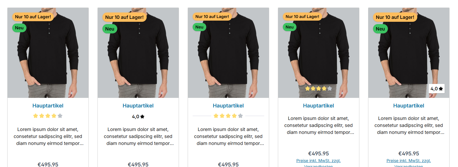
When the rating sits on the product image, you additionally choose whether it sits in a white box or rests, reduced to the essentials, directly on the image. This way you make your customers' trust visible in the style you want.

Tab "Listing pages" => Block "Product box" => Section "Product rating"
New background colours added for the menu items in the flyout and the dropdown navigation
The surfaces of the individual menu items can now be coloured separately – for the default state, the hover and the active category. Flyout and dropdown navigation use the same colours and therefore look identical even if you use both variants side by side.
Tab "Header" => Block "Top navigation flyout" => Section "Colour configuration" => configurations "Background colour (menu items)", "Background colour (menu items) @hover" and "Background colour (menu items) @active"
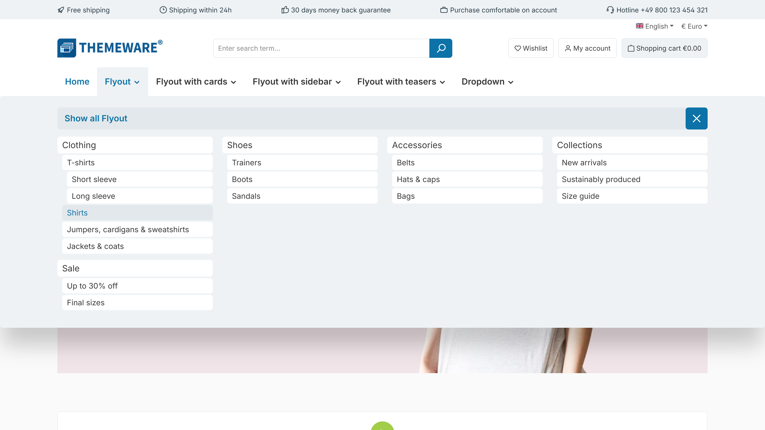
In the flyout the colours are applied in the "Buttons" style, in the dropdown navigation in the "Buttons (compact)" and "Buttons" styles.
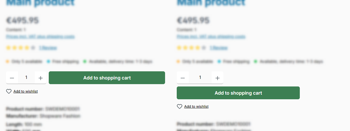
New "Arrangement" configuration added for the quantity selection and the buy button
In Shopware the quantity selection and the buy button sit next to each other in one row. The new "Arrangement" configuration lets you place them below each other instead: the buy button then uses the full width, while the quantity selection sits above it and stays only as wide as it needs to be.
This is especially useful with long button labels or when you display a packaging unit – side by side it quickly gets tight. Express checkout buttons that other extensions add underneath (for example PayPal or Amazon Pay) line up flush in this arrangement.
Tab "Product pages" => Block "Buy box" => Section "Buy widget (Quantity selection and buy button)"
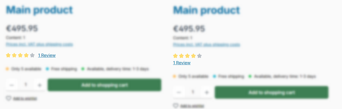
New "Arrangement" configuration added for the product rating in the buy box
In Shopware the review stars and the link to the reviews are stacked. The new "Arrangement" configuration puts both next to each other in one line – this is the default in ThemeWare® and saves height in the buy box.
If there is not enough room, for example in a narrow buy box or on a smartphone, the link automatically moves below the stars. The stars themselves always stay complete in a single row.
Tab "Product pages" => Block "Product rating (in the buy box or at the product name)" => Section "Basic configuration"
New "Description text" configuration added for the Data sheets, Downloads, Properties and Videos tabs
Via the new "Description text" configuration you show an introductory text above the content of these areas. For the product videos and data sheets you choose where the text comes from: a snippet, the custom field in the corresponding product, or both – the custom field remains the default, so nothing changes unless you change it. For the properties and downloads the text comes from a snippet and is hidden by default.
You will find the new configurations in Tab "Product pages" – for the product videos in Block "Product videos (in tabs)", for the datasheets in Block "Datasheets (in tabs)", for the properties in Block "Properties table (in tabs)" and for the downloads in Block "Tab 'Description'" => Section "Downloads".
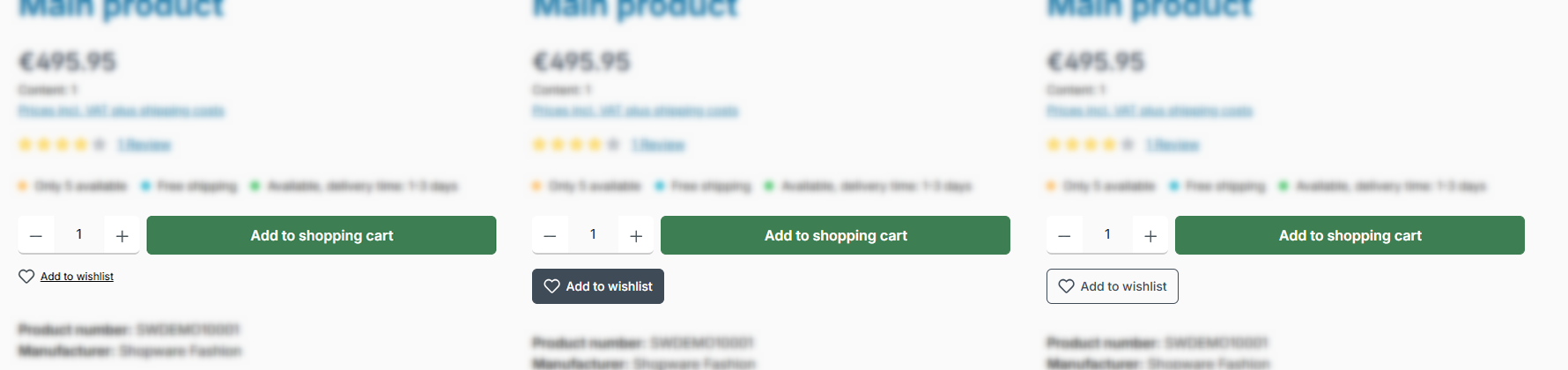
New "Layout type" configuration added for the wishlist button on product pages
Shopware shows "Add to wishlist" below the buy button as a small link with a heart icon. The new "Layout type" configuration turns it into a proper button if you want – filled ("button") or with a border ("button (outline)"). The "link (default)" layout type keeps everything as before.
The colour is set in the second configuration, "Button colour": "Light" or "Secondary". You configure both colour values in the tab "Layout" => area "Buttons" => section "Colour configuration".
The button is only ever as wide as its label – so the buy area above it remains the most prominent element in the buy box.
Tab "Product pages" => Block "Buy box" => Section "Wishlist button ('Add to wishlist')"
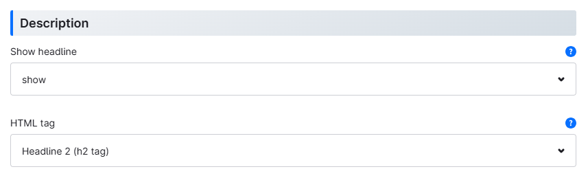
New configuration for the HTML tag of the description heading added Pro Feature-Request
In the CMS element "Product description & reviews (Accordion)" you can now set the heading level (HTML tag) of the description title. Via the new "HTML tag" configuration you choose between a paragraph (P tag) and the heading levels h1 to h6 – h2 by default, matching the clear heading hierarchy of the product page. The visual appearance of the title stays the same; only the semantic level changes, which is relevant for search engines and screen readers, for example.
Thank you very much for this suggestion.
New "Link description" configuration added for the full-area link of the CMS elements Pro
All CMS elements with a full-area link – teasers, banners, hero slides etc. – now offer a new "Link description" configuration in the "Accessibility" section: the text is rendered as aria-label on the link and read out by screen readers as the link text – just like Shopware's image element. In return, the previous title attribute on the full-area link has been removed (it merely duplicated the visible text and is not reliably read out by screen readers). If you have custom CSS or JS selectors targeting the title attribute of the teaser links, please adjust them.
The pure image elements without text content of their own – "Image teaser", "Image banner" and "Image slide (Hero slider)" – protect themselves automatically: if neither a link description is maintained nor the image's alt text provides a name, the title of the media is used. The link therefore remains named for screen readers even without a maintained configuration.
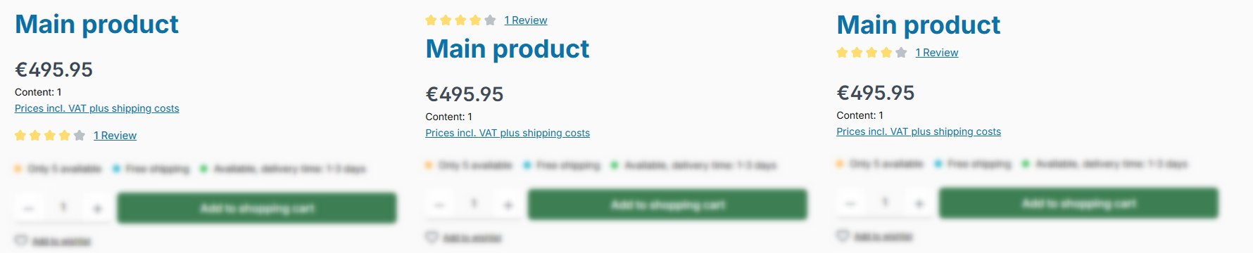
New "Placement" configuration added for the product rating on product pages Feature-Request
In Shopware the rating sits below the price. The new "Placement" configuration moves it right next to the heading instead – either "above the product name" or "below the product name".
That way your customers see the rating while reading the product name, even before the price. The placement works on product pages with the Shopware layout just as it does in the ThemeWare® image gallery blocks with product name. A large manufacturer logo next to the heading does not push the rating down.
Tab "Product pages" => Block "Product rating (in the buy box or at the product name)" => Section "Basic configuration"
Thank you very much for this suggestion.
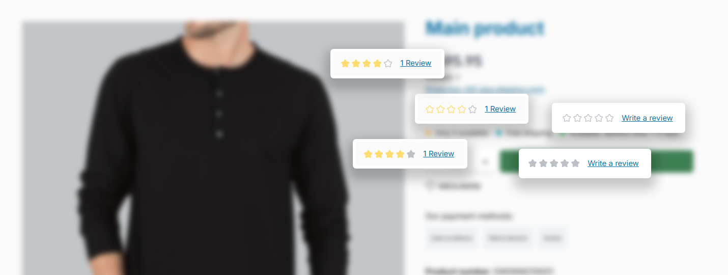
New "Show product rating" configuration added for the buy box on product pages Feature-Request
The review stars in the buy box can now be controlled directly: "don't show" hides them, "show (default)" behaves exactly as before, and "always show product rating" displays the stars even for products that have no rating yet.
Without any reviews, empty placeholder stars appear together with a "Write a review" link that leads straight to the review tab. That way, you're actively inviting your customers to write their first review.
Tab "Product pages" => Block "Product rating (in the buy box or at the product name)" => Section "Basic configuration"
Thank you very much for this suggestion.
New "Drop shadow" configuration added for the flyout and the dropdown navigation
Both submenu surfaces now have their own "Drop shadow" configuration – previously the shadow was hard-wired. You can choose "no shadow" as well as several steps from small to large; for the flyout the existing wide ThemeWare® shadow is available as the "Soft shadow (ThemeWare®)" option.
The defaults match the previous look exactly, so nothing changes on its own. If you like, you can now align the flyout and the dropdown navigation: pick the same step in both fields and both surfaces cast the same shadow.
You set the shadow of the flyout in Tab "Header" => Block "Top navigation flyout" => Section "Basic configuration 'ThemeWare® Flyout'", the one of the dropdown navigation in Section "Basic configuration 'ThemeWare® Dropdown'".
New "Columns" configuration added for the flyout with cards
In the submenu type "ThemeWare® Flyout with cards" you now decide yourself how many cards are shown side by side: 3, 4, 5 or 6. Until now the number was fixed. A few large cards look calmer and show more of the image, many small cards fit all subcategories into a single view.

You only pick one value, the theme takes care of the smaller screens: on desktops at most 4 cards are shown side by side, on tablets at most 3 and on smartphones always 2. Your choice therefore applies to the largest screens, and below that the number is reduced automatically – so the cards always stay large enough for the image to be recognisable.
The default "Automatic" matches the previous behaviour exactly, so nothing changes on its own.
Tab "Header" => Block "Top navigation flyout" => Section "Basic configuration 'ThemeWare® Flyout with cards'" => Configuration "Columns"
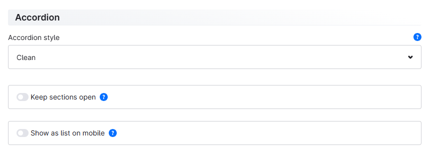
New option "Keep sections open" added to the "Product description & reviews (Accordion)" CMS element Pro Feature-Request
When the "Keep sections open" option is enabled, already opened sections stay open when another section is opened – they no longer collapse automatically. This lets you show several sections at the same time.
Thank you very much for this suggestion.
New option "Show as list on mobile" added to the "Product description & reviews (Accordion)" CMS element Pro Feature-Request
When the "Show as list on mobile" option is enabled, all sections are displayed open as a list on mobile devices – without expanding and collapsing. This way all content is directly visible on small screens.
Thank you very much for this suggestion.
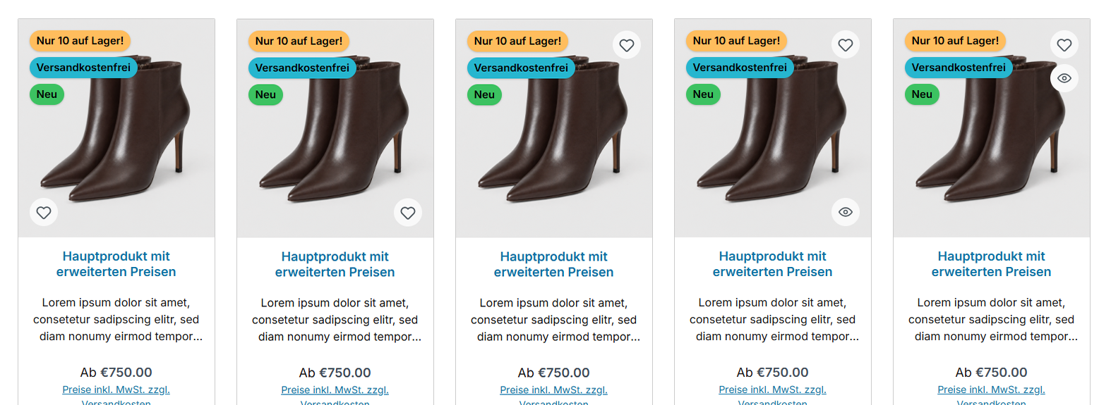
New position "bottom left" added for the wishlist button on the product image
You now decide yourself in which corner of the product image the wishlist button sits: top right, bottom right or – now new – bottom left. This way you place it exactly where it suits your image composition and keeps the view of the product clear.
Tab "Listing pages" => Block "Product box" => Section "Wishlist button" => configuration "Position"
New positions added for the rating in the product box
And you choose where the rating sits: in the box above the product name, now also below it, or directly on the product image – there in the corner of your choice (top right, bottom right, bottom left or bottom center). This way you place this important sales argument exactly where it works best in your overview.
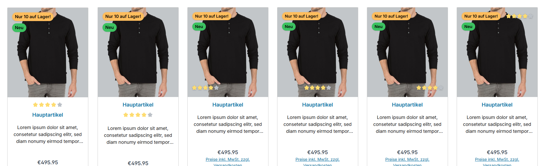
Tab "Listing pages" => Block "Product box" => Section "Product rating"
The previous configuration "Position of the product rating" has been split into two configurations: "Placement" (in the box or on the product image) and the matching "Position" (in the box: above or below the product name – on the product image: the corner). Your previous value is migrated automatically during the update (Pro Edition); you will find the previous configuration for reference in Tab "Others" => Block "Deprecated".
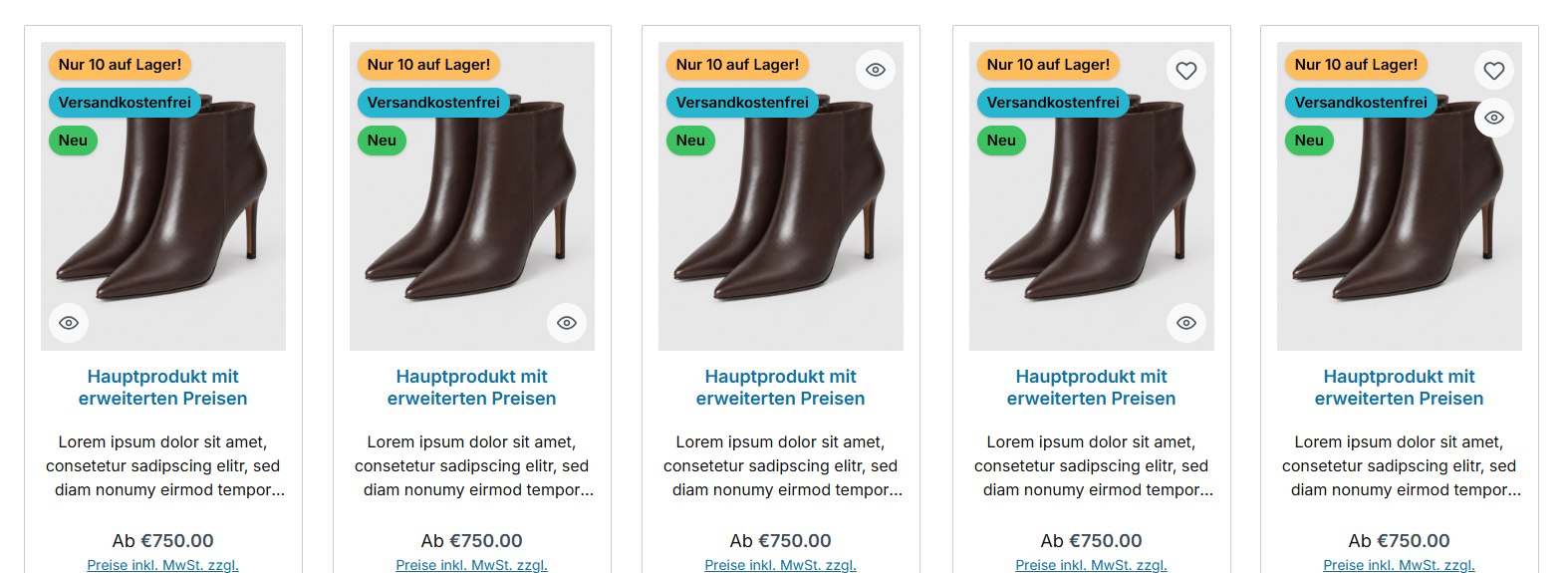
New position choice added for the Quickview button on the product image
The Quickview button can now be positioned freely as well: top right, bottom right or bottom left – or it "docks" to the wishlist button so that both stack in the same corner. This way the button blends harmoniously into your image composition.
Tab "Listing pages" => Block "Product box" => Section "Quickview button" => configuration "Position"
New position choice for product page sections added
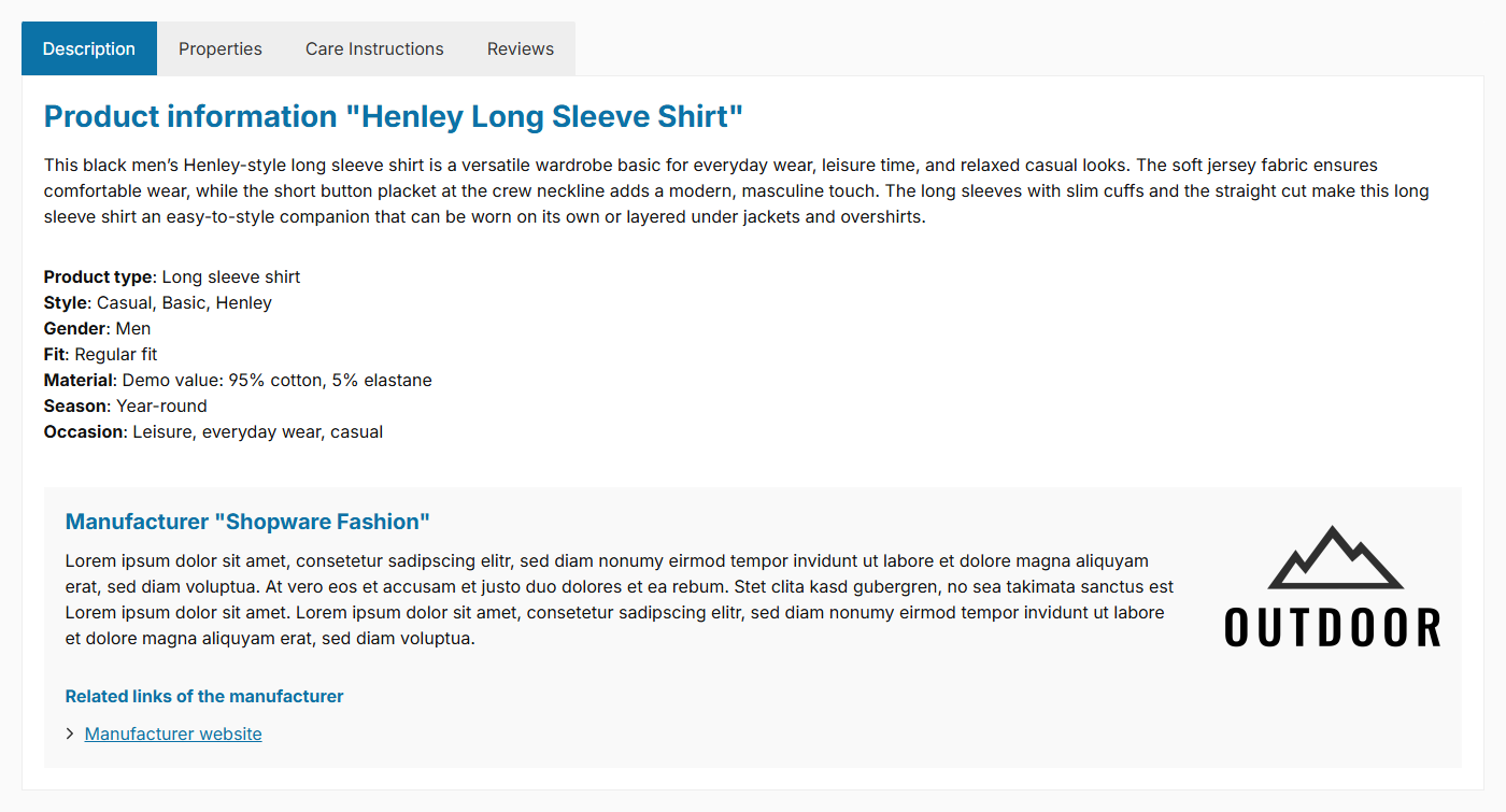
You decide for each section where it appears on the product page: in the product description or as a separate tab. This applies to the properties table, the data sheets, the product videos and the manufacturer details – controlled via the respective display configuration in Tab "Product pages". This way you build the product page exactly as it suits your assortment: everything compact in the description, or clearly spread across dedicated tabs.
When the manufacturer details (including the new GPSR information) are shown in the description, they appear there as a highlighted grey box.
Note: You can read how your previous settings are automatically migrated further below under "Notes in detail".
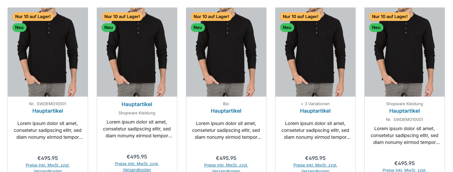
New slots above and below the product name added to the product box
Your product boxes now tell more at a glance. Show exactly the detail that helps your customers decide – right above or below the product name: the product number for quick reference, an inviting teaser text, the manufacturer as a promise of quality or a subtle hint at the available variants (e.g. "+ 7 variations").
Tab "Listing pages" => Block "Product box" => Section "Content"
New "Button style" added to the "Product description & reviews (Accordion)" CMS element Pro
Via the new "Accordion style" configuration you choose the style of the accordion headers: "Clean" (the previous, subtle presentation) or "Buttons", where the headers are displayed as buttons.
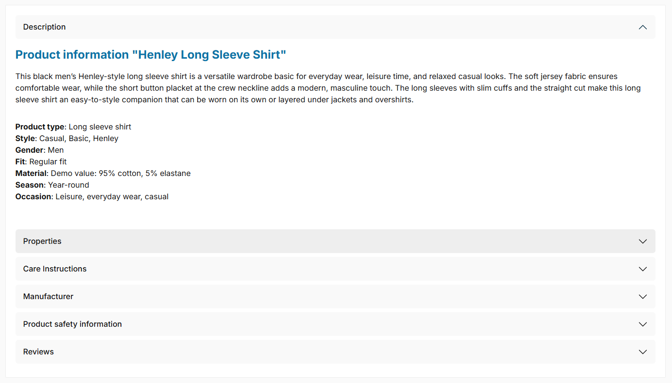
Note: The accordion is still in development. We welcome your constructive feedback.
New glass effect added for the panel of the flyout and the dropdown navigation
The panel can now blur the page content behind it and thereby looks like frosted glass – the content stays recognisable, the menu items stay easy to read. The effect only becomes visible once you choose a semi-transparent background colour for the panel; a value around 10 px is a good starting point.
Tab "Header" => Block "Top navigation flyout" => Section "Colour configuration" => configuration "Glass effect [px] (panel)"
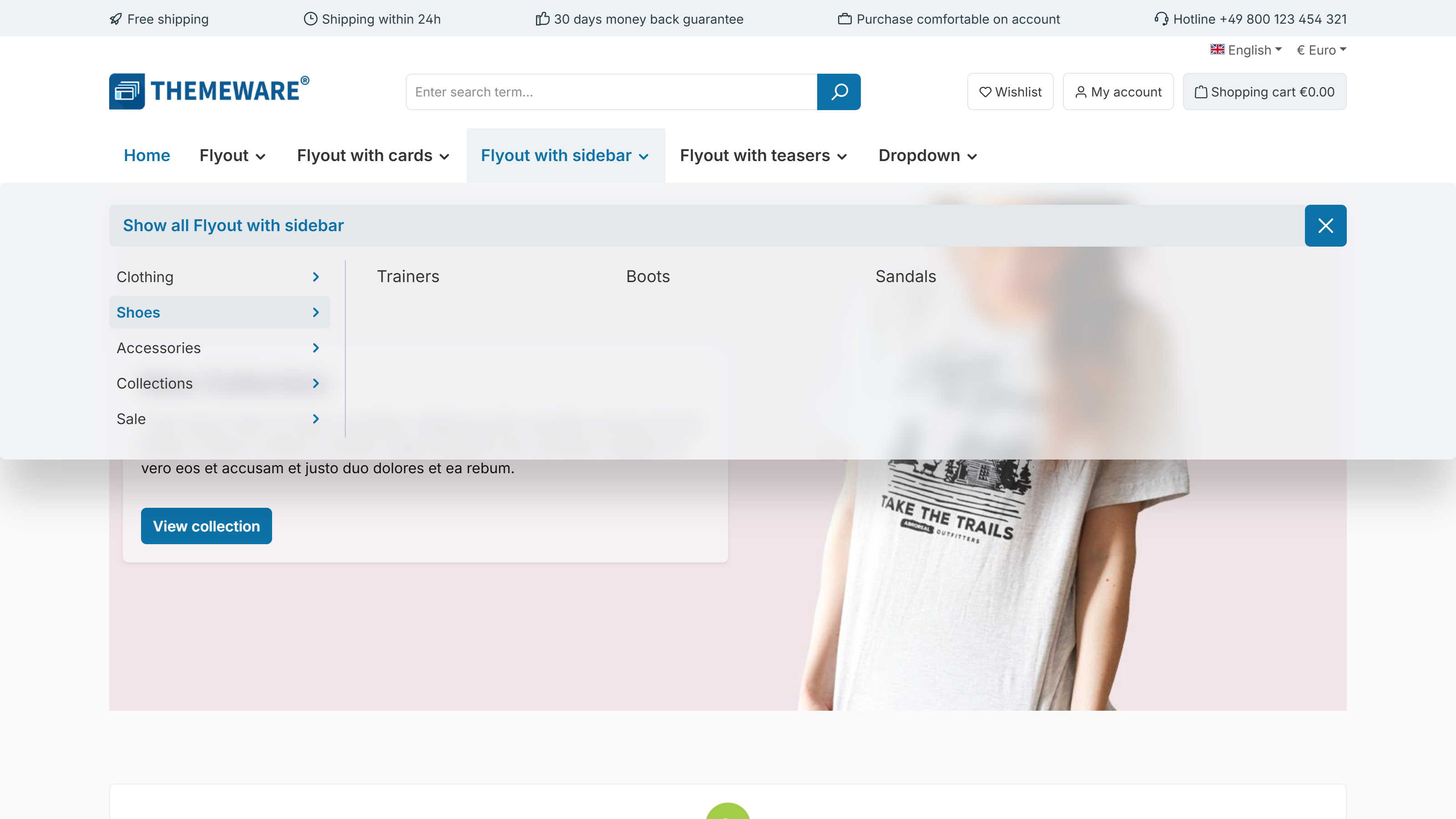
Note: If "Reduce transparency" is enabled in the operating system, the effect is switched off automatically and the surface is displayed opaque.
New hover effect added for the product badges, rating, wishlist and Quickview button on the product image
Less is more: on the product image, the rating as well as the wishlist and Quickview button can now stay discreetly in the background and only fade in gently when a customer hovers over the product box. This keeps the overview pleasantly tidy, and the elements appear exactly when they are needed – the two buttons following one another with a subtle delay. On touch devices everything stays permanently visible, so nothing is hidden there.
The rating can also do it the other way round: with the option "hide on hover" it is permanently visible and gently makes way when hovered. Combine that with buttons revealed on hover and the two swap places – a calm card showing the rating, the actions on hover. The direction the rating fades or slides always follows the chosen corner.
The product badges can make way as well: with "hide on hover" they withdraw towards the left image edge when hovered – several badges one after another with a slight delay, so the stack empties from top to bottom. This clears the product image for the elements appearing there.
For the rating you set the effect in Tab "Listing pages" => Block "Product box" => Section "Product rating" => configuration "Hover effect (on product image)", for the two buttons in the same block => Section "Icon buttons (Wishlist / Quickview button)" => configuration "Hover effect" and for the badges in Block "Product badges (in the product box)" => Section "Basic configuration" => configuration "Hover effect".
New "slide in" hover effect added for the arrow navigation of the sliders
Until now, the slider arrows could only be revealed gently ("fade in"). The new "slide in" option is added: the arrows slide into view from the left and right when the mouse moves over the slider, and withdraw again afterwards. This feels more lively and is less distracting while your customers are simply scrolling.
The effect is available for all sliders – centrally for all of them at once, or individually for the image, gallery and product slider. On touch devices the arrows remain permanently visible as usual, and anyone who has enabled "Reduce motion" in their system will see the arrows without animation.
You set the effect centrally in the tab "Content" => Block "Sliders" => Section "Arrow navigation" => Configuration "Hover effect". To deviate per slider, go to the tab "Shopping Experiences" and the respective block => Section "Arrow navigation (Individual styling)".
New "%manufacturer%" placeholder added for the headlines of the manufacturer and GPSR tabs
You can now word the headlines of the manufacturer tab and the "Product safety information" tab freely and place the manufacturer name wherever you like. Simply write %manufacturer% into the snippet – when the page is opened, the placeholder is replaced by the name of the respective manufacturer.
"More about %manufacturer%" becomes "More about Example Ltd." on the product page, for instance.
The snippets in question are twt.detail.tabManufacturer.headline and twt.detail.tabGpsr.headline. If you leave the placeholder out, nothing changes.
Tip: You can find more information about text blocks and possible placeholders in the Manual.
New "Star style" added for the review stars Feature-Request
A small detail with a big effect: with the new star style you bring the review stars in line with your design. You can choose "Solid (default)" with classic filled stars, "Outline (empty stars)" where only the stars that have not been reached turn into a fine outline, and "Outline" for a consistently light, modern look. Your choice automatically applies everywhere stars appear: in the product boxes, on the product page and in the testimonials.
Tab "Layout" => Block "Product rating" => Section "Basic configuration"

Thank you very much for this suggestion.
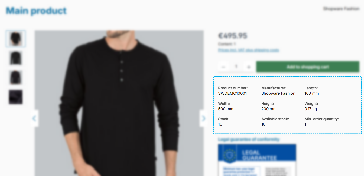
New "Compact" style added for the product specifications in the buy box Feature-Request
The product specifications in the buy box – e.g. product number, manufacturer, GTIN/EAN, dimensions and weight – can now be displayed as a space-saving compact grid: the entries are arranged side by side with the label subtly above the value, and wrap automatically depending on the available space.
Tab "Product pages" => Block "Product specifications (in the buy box)" => Section "Basic configuration" => new configuration "Style"
Thank you very much for this suggestion.
Unified the spacing of the elements in the buy box
The ThemeWare® elements in the buy box – product specifications, product symbols, benefits, payment logos and sharing links – now use a uniform vertical spacing. Previously, each element had slightly different spacings.
Unified the spacing of the badges, wishlist and Quickview button on the product image
All elements that sit on the product image – the badges ("New", discount, top seller), the wishlist and Quickview button as well as the rating – now keep the same distance to the image edge.
The spacing also adapts to the image display: with full-width images the elements move a little further away from the edge than with bordered images.
The "List in columns (Shopware 5)" style now only applies to the flyout
The style arranges the categories in columns, just like the flyout of Shopware 5. In the "Flyout with cards", "Flyout with sidebar" and "Flyout with teasers" displays it overlapped with their own arrangement – those now use the "List" style.
The animation of the flyout now also applies to the dropdown navigation
The "Animation" configuration only controlled the opening of the flyout so far. It now applies to both submenu surfaces: the dropdown navigation opens with the same animation.
Because the setting now applies to both surfaces, it has moved – together with the "Navigation levels" – into the general "Basic configuration" section.
Tab "Header" => Block "Top navigation flyout" => Section "Basic configuration"
Properties configuration bundled in the new Block "Properties table (in tabs)"
The settings of the properties table – display type, style, width and the info text – are now bundled in Block "Properties table (in tabs)" of the theme configuration. Previously they were spread across the Blocks "Layout" and "Tab 'Description'". Together with the display configuration and the subheadline, everything related to the properties table can now be found in one place.
Improved the focus rings for keyboard navigation Feature-Request
If you navigate the shop with a keyboard, every element shows the same frame – the focus ring. Until now it looked different depending on the component: black in some places, in the primary colour in others. It is now the same everywhere and can be coloured centrally.
Tab "Others" => Block "Accessibility" => "Focus shadow colour @focus" configuration
Coloured buttons keep their own colour: the buy button shows its ring in the buy colour, the primary button in the primary colour. Everything else – links, icons, form fields, configurator options, quantity selector, footer widgets – follows the setting above.
Fixed along the way: the "Details" button in the product box and the quantity selector used to have a barely visible ring because it was drawn in their own, very light colour. Both now use the standard ring.
Thank you very much for this suggestion.
Manufacturer configuration bundled in the new Block "Manufacturer (in tabs)"
The settings for the manufacturer display in the tabs (logo, related links, subheadline) are now bundled in the new Block "Manufacturer (in tabs)" of the theme configuration.
In the list view the product image is linked again Feature-Request
Since Shopware 6.7 the product image in the product box no longer carries its own link – instead an invisible link of the product name is stretched across the entire card. In the list view we deliberately switch that full-area link off so the long description text stays selectable and copyable. As a result the image was no longer clickable there. It has its own link again – without any downside for accessibility: the link is hidden from screen readers and not reachable via tab, so exactly one link per product is still announced. The wishlist and Quickview buttons on the image are unaffected.
Note: The list view is still in development. We welcome your constructive feedback.
Thank you very much for this suggestion.
Moved the "Show subheadline" configuration to Block "Properties table (in tabs)"
The configuration for the subheadline above the properties table (previously "Show subheadline above properties table" in Block "Tab 'Description'") is now called "Show subheadline" and can be found in Block "Properties table (in tabs)" – where the other settings of the properties table are located.
In addition, the subheadline now applies wherever the properties table is displayed – including the separate tab. Your previous value is migrated automatically during the update (Pro Edition).
Note: You will find the previous configuration for reference in Tab "Others" => Block "Deprecated".
Improved the delivery information on product pages
We have thoroughly reworked the availability notices in the buy box – "Free shipping", "Available", "Sold out" and the others.
The main point: you can now show and hide each notice individually. So if you would like to show the delivery time but not the free shipping notice (because it is already displayed as a badge on the image), you can do that from now on.
For the appearance you can choose from four layout types instead of the previous two: "Text", "Label", "Badge" and "Chip" – the same ones as in the product box. All notices also sit in one shared group with consistent spacing; previously they had different spacings depending on the setting and were sometimes separated from each other.
Tab "Product pages" => Block "Delivery information (in the buy box)"

If you prefer to stay with Shopware's standard display, you can switch to it via a compatibility option.
Tab "Others" => Block "Compatibility (HC-Architecture®)" => Section "Product page"
The maximum height now takes precedence over the maximum width in the "Awards, seals or certificates" widget
Previously, one of the two size fields in the "Awards, seals or certificates" footer widget had to be set to "none" manually – if both were filled, both were ignored and an internal default (100 pixels width) was used. Now a simple rule applies: If a maximum height is set, it takes precedence – this way all images get a uniform height (recommended). The maximum width only applies while the height is set to "none". For correctly configured shops, this will not change anything.
Modal, offcanvas, cookie notice and fullscreen search now respect the "Reduce transparency" system setting
If the "Reduce transparency" setting is enabled in the operating system, the glass effect of these four overlays is switched off.
Reworked the product box in the list view: product image, badges and buttons are now aligned consistently
In the list view the product image sits to the left of the text. Until now the product badges (e.g. "New" or "Free shipping") were anchored to the top of the row instead of to the image – the longer the product text, the further they drifted away from the image and the more they were out of line with the wishlist and Quickview buttons. The badges now sit on the product image and keep the same distance to the image edge as those two buttons and the rating on the image – exactly like in the grid view.
On top of that, the image and the text column now start on one line: image, badges, buttons and the product name all begin at the same height, instead of the image floating in the middle next to the text.
Note: The list view is still in development. We welcome your constructive feedback.
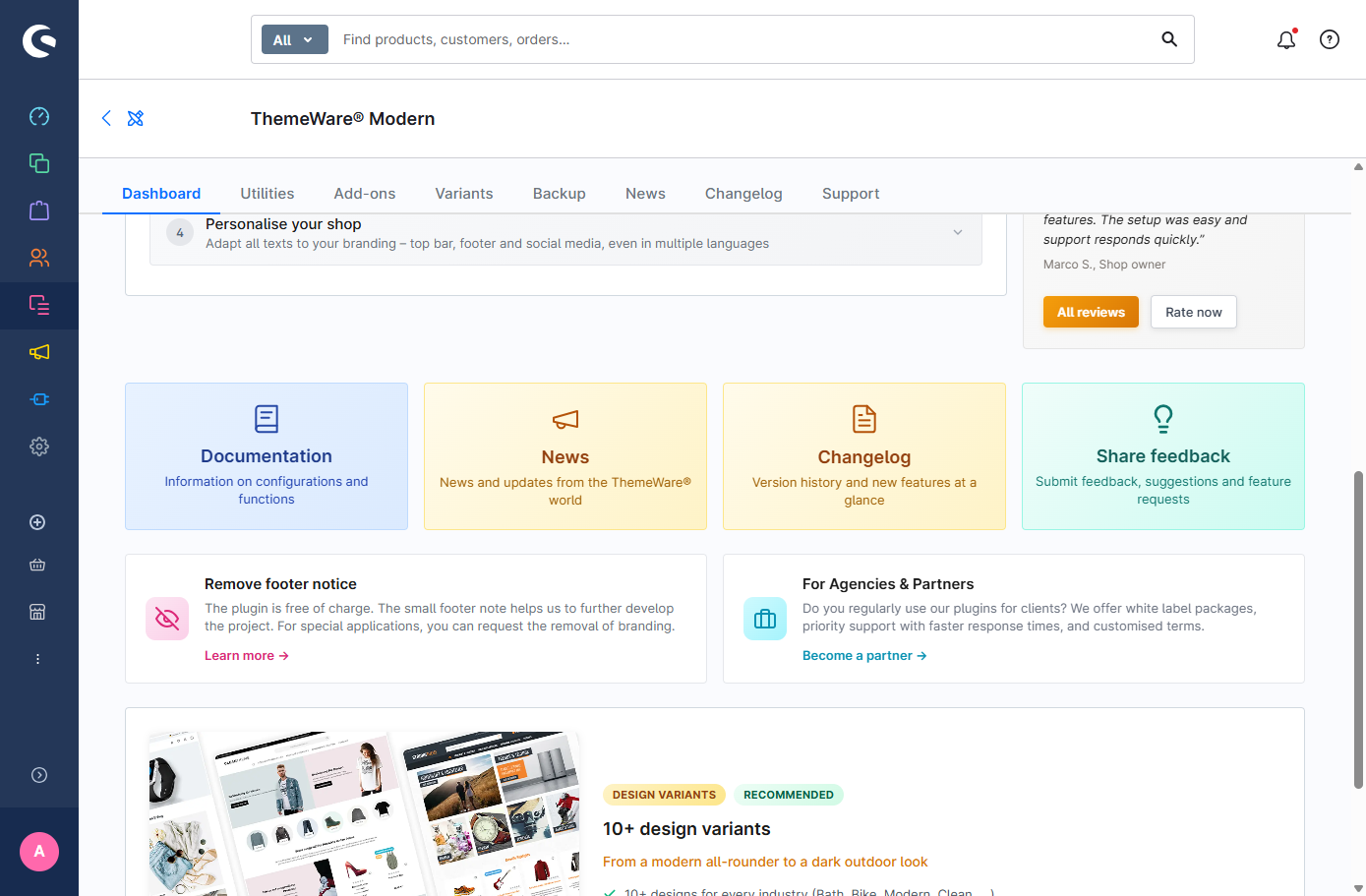
Improved feedback, news and links in the ThemeWare® Hub
The "Share feedback" card now takes you straight to our feature request page instead of opening a form inside the Hub. In the English administration the news area now shows the English articles as well, and a few links to the manual there now point to the right language version.
Improved the performance of the sticky top navigation
The sticky top navigation now works more efficiently: cart and search only change their place when the navigation actually docks or releases – previously this happened on every single scroll step. Resizing the window no longer resets everything either. This is most noticeable on weaker devices and long pages.
Bugfix: Animations of CMS blocks are no longer played in modals
When CMS content with a reveal animation was opened inside a modal – the content shifted once more while opening. Animations are now switched off completely inside modals, so the content sits in place right away.
Bugfix: CMS elements are only fully linked when a URL has been set Pro
In the CMS elements "Button teaser", "Call-to-Action" and "Call-to-Action slide (Hero slider)", a link was rendered around the entire element when the "Entire element clickable" option was enabled – even if no URL had been set. Clicking it merely reloaded the current page. The full-area link is now only rendered when a URL is configured, in line with the other teaser elements.
Bugfix: The "Custom content" is no longer shown when the custom field is empty Pro
In the CMS element "Product description & reviews (Accordion)" the "Custom content" section was shown even when the corresponding custom field on the product was empty – an empty section appeared. The section is now only displayed when content is actually maintained – in line with the "Properties", "Manufacturer" and "Product safety (GPSR)" sections.
Bugfix: The sticky top navigation now appears exactly when the navigation reaches the top of the screen
The switching point is now measured directly at the navigation. That way it is spot on in every combination – including with an announcement banner and regardless of where the USP bar is placed.
In addition, the switching point is determined again on every movement. When a visitor closes the announcement banner, the sticky top navigation takes effect at the new position right away – previously this required resizing the browser window first.
Note: The "Scroll top" configuration is therefore an addition on top of that switching point – with the default value of 0 it sits correctly by itself. If you previously entered a value there to compensate for the height of the header, the USP bar or the announcement banner, it is now added on top and the sticky top navigation appears too late. In that case, please reset the value to 0.
Tab "Header" => Block "Sticky top navigation (Basic headers: 'Header 1' and 'Header 2')" => Section "Basic configuration" => configuration "Scroll top"
Bugfix: The sticky top navigation is released again when the window is resized below the configured minimum width
The "Show from..." configuration defines the screen width from which the sticky top navigation takes effect. With the "Container-max-width (Full-width Boxed)" setting the navigation stayed fixed when the browser window was resized below that width. It is now released reliably in all settings.
On top of that, the "Tablet (landscape) (≥992px)" and "Desktop (≥1200px)" settings now take effect at exactly the stated width.
Bugfix: The sticky top navigation reserves the correct height again after the window has been resized
If the browser window was resized while the sticky top navigation was fixed, too much space could be reserved afterwards – the page content jumped on the next scroll. The space needed is now measured correctly in every situation.
Bugfix: The sticky top navigation no longer shifts the page content when it appears and disappears
The sticky top navigation now reserves the space it needs exactly where it sits. The page stays put when the navigation appears and disappears, which has a direct positive effect on the Cumulative Layout Shift (CLS) and therefore on your Core Web Vitals.
Scrolling feels noticeably calmer as a result – especially on large desktop screens, where the navigation appears and disappears most often.
Note: If you have been controlling this spacing with your own CSS code, you can now remove it.
Thank you very much for pointing that out.
Bugfix: The "Reduce motion" system setting now also switches off the animations of the CMS blocks and the submenu
Anyone who has enabled "Reduce motion" in their operating system deliberately does not want to see animations in the shop. Until now only the soft transitions were switched off – the actual animations of the CMS blocks, their headlines and the submenu kept running. The setting now applies consistently: the content appears immediately and in full, without any movement.
Bugfix: Fixed duplicate block names in the configuration of some CMS elements Pro
In the configuration templates of some ThemeWare® CMS elements a block name was assigned twice. In rare cases this could prevent the configuration of the element from opening. The names are now unique.
Bugfix: Fixed an incorrect title fallback and missing German help texts for custom fields
For the custom fields for downloads, datasheets and related links, the German help texts were not stored in the admin and therefore not displayed. In addition, downloads without their own title used an incorrect fallback text ("Datasheet" instead of "Download"). Both issues are now fixed: the title falls back to the title stored in the media manager as intended, and the German help texts are displayed correctly again.
Bugfix: Fixed the help text of the headline configurations in various CMS elements Pro
In several CMS elements, the help text of the "Headline" configuration contained a note about a snippet fallback that only applies to the "Subcategory navigation (Sidebar)" CMS element. The general help text has been corrected – the note now only appears where it actually applies.
Bugfix: The wishlist and Quickview buttons are round again in the list view
In the list view the elements of the product box are displayed more compactly. That adjustment also reset the size of the circular icon buttons, which stretched the wishlist button vertically and made it look oval. Both buttons now keep their fixed size and stay round.
Bugfix: Sticky sections no longer get stuck on mobile devices
On mobile devices, sticky sections (e.g. the gallery and buy box, as well as the sidebar) could "get stuck" while scrolling because sticky behavior was also applied when these sections were stacked vertically rather than displayed side by side. Sticky behavior is now enabled only from the viewport width at which the sections are actually positioned next to each other.
Bugfix: Variants and other buttons now respond again on touch devices when tapped for the first time
On touch devices (e.g. iPhone, iPad), some elements such as the variant selection only responded to the second tap, because Safari treats the first tap as a hover. ThemeWare® now serves hover effects only to devices with a mouse pointer: everything responds instantly on touch devices, and content revealed on hover is always visible there.
Thank you very much for pointing that out.
Notes in detail
The dropdown navigation now uses the colours of the submenus instead of the colours of the top navigation
Until now the dropdown navigation took its colours from the top navigation. So that flyout, cards, sidebar, teaser and dropdown share one colour world, it now uses the colours of the submenus – like every other display.
If your top navigation is coloured, the dropdown navigation will look different after the update. Please check your colour settings in Tab "Header" => Block "Top navigation flyout" => Section "Colour configuration" and adjust them if necessary.
Configuration key of the flyout style changed
The "Style" configuration of the flyout is now called "Flyout" and is located in Section "Design". Your previous value is migrated automatically during the update.
If you query this configuration in your own templates or SCSS customizations, please switch to the new key:
- Flyout: "Style" → "Flyout"
twt-nav-main-flyout-style→twt-nav-main-flyout-design
Configuration and template files of the delivery information on product pages updated
The six "Show … label" configurations (free shipping, delivery time, pre-order, ready for shipping, sold out, not available) have been replaced by new fields that now actually switch the visibility. You can still look up the previous fields in Tab "Others" => Block "Deprecated"; they no longer have any effect.
The templates have changed as well: the six states now live together with the stock label in themeware/product-detail/twt-delivery-information.html.twig. The previous twt-product-detail-labels.html.twig only forwards to it. Please review your configuration as well as your template and CSS customizations.
Configuration and template files for tabs on product pages updated
The template files of the tabs on product pages have been restructured: The previous tab templates have been split into a tab wrapper (tab/) and the actual content (tab-content/). Thanks to these changes, content that was previously only used in tabs can now also be used elsewhere, e.g. in the accordion.
Base directory: Resources/views/storefront/themeware/product-detail/
Removed files:
twt-product-detail-tab-custom.html.twigtwt-product-detail-tab-datasheets.html.twigtwt-product-detail-tab-manufacturer.html.twigtwt-product-detail-tab-product-videos.html.twigtwt-product-detail-tab-properties.html.twig
New files (tab wrappers):
tab/twt-product-detail-tab-custom-content.html.twigtab/twt-product-detail-tab-datasheets.html.twigtab/twt-product-detail-tab-gpsr.html.twigtab/twt-product-detail-tab-manufacturer.html.twigtab/twt-product-detail-tab-product-videos.html.twigtab/twt-product-detail-tab-properties.html.twig
New files (tab contents):
tab-content/twt-product-detail-custom-content.html.twigtab-content/twt-product-detail-datasheets.html.twigtab-content/twt-product-detail-gpsr.html.twigtab-content/twt-product-detail-manufacturer.html.twigtab-content/twt-product-detail-product-videos.html.twigtab-content/twt-product-detail-properties.html.twig
New files (includes):
includes/twt-product-manufacturer-information.html.twigincludes/twt-product-manufacturer-links.html.twigincludes/twt-product-responsible-person.html.twig
Moved files (accordion):
twt-product-description-accordion.html.twig→accordion/twt-product-detail-description-content.html.twigtwt-product-reviews-accordion.html.twig→accordion/twt-product-detail-reviews-content.html.twig
Note: If you've made any template customizations to tabs, please check them after the update.
Configuration:
The display of the properties, product videos, datasheets and manufacturer sections is now controlled via one unified selection. Instead of separate switches for tab and description, you simply choose per section where it should appear:
- don't show
- show in the description
- show in a separate tab
- show in the manufacturer tab (only for the new GPSR information)
Note: These are not additional configurations. The existing "Show …" switches have merely been extended by the position selection (description or separate tab) – the previously separate "Show … tab" switches have been merged into them.
Important: In the Pro edition, your previous values are migrated automatically to the new configurations during the update. In the Cloud edition, no automatic migration is available.
Please check the new position configurations after the update and reconfigure them if necessary!
What happens to my existing settings?
The previous configurations have been marked as deprecated and moved. You will find them – and thus your previous values for reference – under:
- Tab "Others" => Block "Deprecated".
Overview: previous → new configuration
You will find the new configurations in Tab "Product pages" in the respective block:
| Block | Previously (now under "Deprecated") | New |
|---|---|---|
| Properties | "Show properties table in a seperate tab" | "Show properties table" |
| Product videos | "Show product videos tab" | "Show product videos" |
| Datasheets | "Show datasheets tab" | "Show datasheets" |
| Manufacturer | "Show manufacturer tab" | "Show manufacturer" |
| Properties info text | "Show info text below properties table" (separate for tab and description) | "Show info text below properties table" (shared) |
| Properties subheadline | "Show subheadline above properties table" | "Show subheadline" |
If you query one of these configurations in your own templates, please switch to the new key:
- Properties: "Show properties table in a seperate tab" → "Show properties table"
twt-product-detail-properties-position→twt-product-detail-properties-table-show
- Product videos: "Show product videos tab" → "Show product videos"
twt-product-detail-tab-product-videos-show→twt-product-detail-product-videos-show
- Datasheets: "Show datasheets tab" → "Show datasheets"
twt-product-detail-tab-datasheets-show→twt-product-detail-datasheets-show
- Manufacturer: "Show manufacturer tab" → "Show manufacturer"
twt-product-detail-tab-manufacturer-show→twt-product-detail-product-manufacturer-show
- Properties info text: "Show info text below properties table"
twt-product-detail-tab-properties-info-show→twt-product-detail-properties-info-show
- Properties subheadline: "Show subheadline above properties table" → "Show subheadline"
twt-product-detail-properties-headline-show→twt-product-detail-properties-title-show
Template structure of the CMS teaser elements unified Pro
The image markup of the teaser elements (image container, img attributes, thumbnails) is now rendered centrally via a shared template:
Resources/views/storefront/themeware/includes/twt-cms-image-wrapper.html.twig
The element templates call this include instead of rendering the markup themselves. The storefront output does not change – but future improvements to the image markup will automatically benefit all teaser elements at once.
Important: If you have made custom template adjustments (sw_extends) to the teaser elements: Only the …_image_media blocks listed below have been removed – overrides on them no longer take effect (replacement below). All other blocks remain unchanged, existing overrides on them continue to work.
Removed from each teaser element is the inner media block (base directory: Resources/views/storefront/element/):
cms-element-twt-advanced-teaser.html.twig:element_twt_advanced_teaser_image_mediacms-element-twt-button-teaser.html.twig:element_twt_button_teaser_image_mediacms-element-twt-call-to-action.html.twig:element_twt_call_to_action_image_mediacms-element-twt-category-teaser.html.twig:element_twt_category_teaser_image_mediacms-element-twt-category-teaser-advanced.html.twig:element_twt_category_teaser_advanced_image_mediacms-element-twt-category-teaser-classic.html.twig:element_twt_category_teaser_classic_image_mediacms-element-twt-category-teaser-modern.html.twig:element_twt_category_teaser_modern_image_mediacms-element-twt-classic-teaser.html.twig:element_twt_classic_teaser_image_mediacms-element-twt-hero-teaser.html.twig:element_twt_hero_teaser_image_mediacms-element-twt-hover-box.html.twig:element_twt_hover_box_image_mediacms-element-twt-hover-teaser.html.twig:element_twt_hover_teaser_image_mediacms-element-twt-image-teaser.html.twig:element_twt_twt_image_teaser_image_mediacms-element-twt-modern-teaser.html.twig:element_twt_modern_teaser_image_mediacms-element-twt-teaser.html.twig:element_twt_teaser_image_mediacms-element-twt-text-teaser.html.twig:element_twt_text_teaser_image_mediacms-element-twt-text-teaser-decorated.html.twig:element_twt_text_teaser_decorated_image_media
All other blocks (…_alignment, …_inner, …_content_container, …_content, …_image_container) remain in all element templates.
The blocks element_twt_*_content and element_twt_*_image_container remain unchanged: the link, the alignment wrapper and the capture variable imageElement still live in the respective element template. Existing overrides on these blocks therefore continue to work unchanged – including those using parent() or their own imageElement output.
Only the inside of the image container has moved into the shared include. For adjustments to it, the include provides its own blocks:
| Element block | Counterpart in the include (for all teasers) |
|---|---|
element_twt_*_image_media (removed) |
twt_cms_image_wrapper_media |
element_twt_*_image_container (remains) |
twt_cms_image_wrapper_container |
You override the include blocks via template inheritance – either for all teaser elements at once or specifically for a single element by checking element.type:
{% sw_extends '@Storefront/storefront/themeware/includes/twt-cms-image-wrapper.html.twig' %}

{% block twt_cms_image_wrapper_media %}
    {% if element.type == 'twt-button-teaser' %}
        {# custom media output for the button teaser only #}
    {% else %}
        {{ parent() }}
    {% endif %}
{% endblock %}
Alternatively, you can still override the …_inner block of the respective element template and render completely custom markup there instead of the include call.
Subheadlines and subtitles on product pages now use unified CSS classes
The subheadlines and subtitles of the product page sections (properties, product videos, datasheets, manufacturer, GPSR, product symbols) now use a unified class system: in the description twt-product-detail-description-subheadline and twt-product-detail-description-subtitle as before, in separate tabs and in the accordion the new counterparts twt-product-detail-tab-subheadline and twt-product-detail-tab-subtitle. The spacings are identical – but can now be adjusted separately for the description and the tabs.
Important: The titles of the datasheets and product videos (including "YouTube"/"Vimeo") are no longer rendered as a real <h5>. If you have custom CSS or JS selectors targeting h5 in these areas, please switch them to the new classes.
- Datasheet and video titles (including "YouTube"/"Vimeo") are now rendered as
<div class="h5 …">instead of<h5>– withtwt-product-detail-description-subtitlein the description andtwt-product-detail-tab-subtitlein tabs. The titles therefore no longer appear in the page's heading hierarchy. - The GPSR subtitles ("Manufacturer information", "Responsible person") now carry the subtitle class depending on their position (description vs. tab).
- The GPSR subheadline in the manufacturer tab carries
twt-product-detail-tab-subheadlineinstead oftwt-product-detail-description-subheadline. - New: In the tab/accordion, the subheadline above the properties table is rendered via the
twt_product_detail_tab_properties_subheadlineblock with the classestwt-product-properties-title twt-product-detail-tab-subheadline.
After the update: a short checklist
Here is the short version of what to look at after the update – in order, doable in about 15 minutes:
- Check the navigation colours. Open a submenu in your shop. Do the flyout and dropdown still look the way they did? If not: Tab "Header" => Block "Top navigation flyout" => Section "Colour configuration".
- Check the flyout style. The configuration key has changed. Have a look to see whether the style you want is still selected: Tab "Header" => Block "Top navigation flyout" => Section "Design" => configurations "Flyout" and "Dropdown navigation".
- Check the submenu animation. There are now six options instead of three. If you had "swing in down" selected, please pick a new one: Tab "Header" => Block "Top navigation flyout" => Section "Basic configuration" => configuration "Animation".
- Look at a product page. Is the delivery information in the buy box correct – notes such as "Free shipping" or "Delivery time"? Appearance and position are set in Tab "Product pages" => Block "Delivery information (in the buy box)".
- Click through the product page tabs. Are all the tabs there that you expect, and are the headlines right? Whether a section appears as its own tab or inside the description is set in Tab "Product pages" in the respective block: "Properties table (in tabs)", "Product videos (in tabs)", "Datasheets (in tabs)", "Manufacturer (in tabs)" and "GPSR – Product safety (in tabs)". The tab titles themselves are changed via the snippets.
- Test your own customizations. Only if you or your agency maintain custom templates, custom CSS or custom snippets: please go through those once. There is no theme configuration for this – it affects your own files as well as the snippets under "Settings" => "Shop" => "Snippets". Which ones are affected is described in the sections above.
Tip: Point 6 does not apply if you use ThemeWare® without individual programming. Points 1 to 5 are enough in that case.
We hope you enjoy the new update and all the improvements as much as we do. As always, we truly appreciate your feedback, ideas, and real-world experiences — because that’s exactly what helps us keep improving and modernizing ThemeWare®.
Thank you for your trust, and we wish you continued success with your shop!
Sebastian and the ThemeWare® team